Chapter 1 Visualization
ggplot2 is a powerful package for data visualization in R. Most of the figures in this chapter are plotted using ggplot2. Other great packages such as VennDiagram, UpSetR, and ComplexHeatmap are used to generate special figures like Venn diagram, UpSet, and Heatmap, etc.
1.1 Boxplot
### Normal, 2 groups

dataForBoxPlot <- readRDS('data/dataForBoxPlot.rds')

dataForBoxPlot$expr <- dataForBoxPlot$DSG3
dataForBoxPlot$group <- factor(dataForBoxPlot$SampleType, levels=c('Normal','Dysplasia'))

pValue <- wilcox.test(dataForBoxPlot$expr~dataForBoxPlot$group)$p.value

anno <- data.frame(x = 1.5, y = 5,
                   label = ifelse(pValue >= 0.01, paste0('p = ', formatC(pValue, digits = 2)),
                                  paste0('p = ', formatC(pValue, format = "e", digits = 2))),
                   dataset='GSE79209')

ggplot(data=dataForBoxPlot, aes(x=group, y=expr)) +
  geom_boxplot(aes(fill=group),
               outlier.shape = NA, outlier.size = NA, #outlier.colour = 'black',
               outlier.fill = NA) +
  facet_wrap(~dataset, nrow=1) +
  geom_jitter(size=2, width=0.05, color='black') + #darkblue
  #scale_fill_manual(values=c("#56B4E9", "#E69F00")) +
  labs(x='', y=expression('Expression Level (Log'[2]*'CPM)')) +
  #geom_segment(data=df,aes(x = x1, y = y1, xend = x2, yend = y2)) +
  geom_text(data =anno, aes(x, y, label=label, group=NULL),
            size=4) +
  theme(legend.position = 'none')+
  theme(axis.text = element_text(size=14,color='black'),
        axis.text.x = element_text(angle = 0, hjust = 0.5),
        axis.title = element_text(size=16)) +
  theme(strip.text = element_text(size=14, face='bold')) +
  theme(plot.margin =  margin(t = 0.25, r = 0.25, b = 0.25, l = 0.25, unit = "cm"))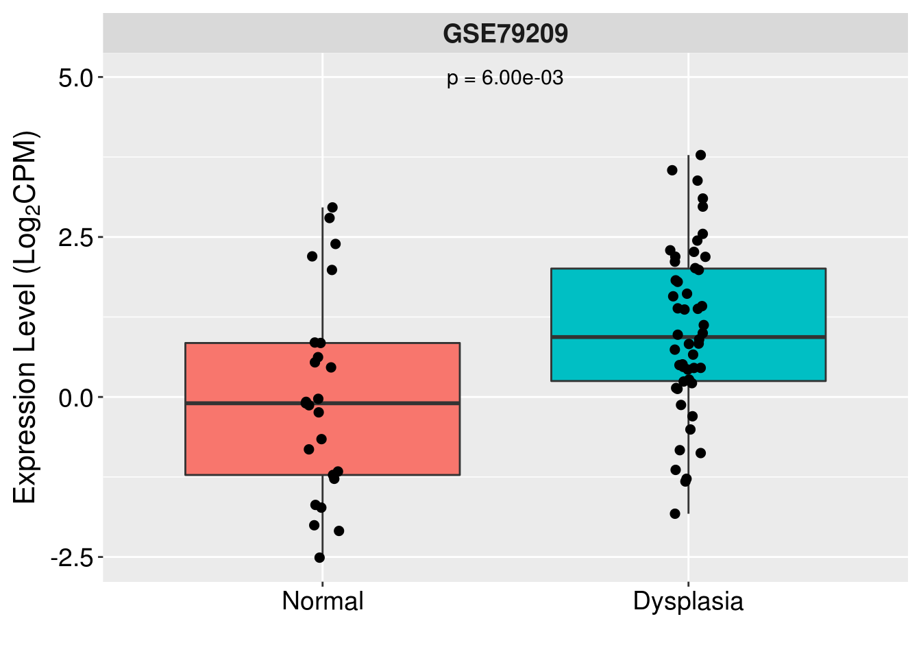
### Add stats manually, 3 groups

dataForBoxPlot <- readRDS('data/dataForBoxPlot.rds')

#dataForBoxPlot <- filter(dataForBoxPlot,
#                         HistologyGrade %in% c('Normal','Mild dysplasia','Moderate dysplasia'))


dataForBoxPlot <- dataForBoxPlot[dataForBoxPlot$HistologyGrade
                                 %in% c('Normal','Mild dysplasia','Moderate dysplasia'),]


dataForBoxPlot$expr <- dataForBoxPlot$DSG3
dataForBoxPlot$group <- factor(dataForBoxPlot$HistologyGrade,
                               levels=c('Normal','Mild dysplasia','Moderate dysplasia'))

t <- pairwise.wilcox.test(dataForBoxPlot$expr, dataForBoxPlot$group,
                          p.adjust.method = 'none')

#t <- pairwise.t.test(dataForBoxPlot$expr, dataForBoxPlot$group,
#                     p.adjust.method = 'none')

pValue <- c(t$p.value)[!is.na(c(t$p.value))]

df <- data.frame(x1=c(1,2,1, 1,3,1, 2,3,2), # 1 vs. 2; 1 vs. 3; 2 vs. 3
                 x2=c(1,2,2, 1,3,3, 2,3,3),
                 y1=c(5,5,5.2, 6,6,6.2, 5.5,5.5,5.7),
                 y2=c(5.2,5.2,5.2, 6.2,6.2,6.2, 5.7,5.7,5.7))


anno <- data.frame(x=c(1.5,2,2.5),
                   y=c(5.3,6.3,5.9),
                   label=as.character(symnum(pValue, #corr = FALSE, na = FALSE,
                                             cutpoints = c(0, 0.001, 0.01, 0.05, 1),
                                             symbols = c("***",'**','*','ns'))))

#anno <- data.frame(x=c(1.5,2,2.5),
#                   y=c(8.55,8.95,8.8),
#                   label = ifelse(pValue >= 0.01,
#                                  paste0('p = ', formatC(pValue, digits = 2)),
#                                  paste0('p = ', formatC(pValue, format = "e", digits = 2))))

ggplot(data=dataForBoxPlot, aes(x=group, y=expr)) +
  geom_boxplot(aes(fill=group),
               outlier.shape = NA, outlier.size = NA, #outlier.colour = 'black',
               outlier.fill = NA) +
  facet_wrap(~dataset, nrow=1) +
  geom_jitter(size=2, width=0.05, color='black') + #darkblue
  scale_color_manual(values=c("#56B4E9", "#E69F00")) +
  labs(x='', y=expression('Expression Level (Log'[2]*'CPM)')) +
  geom_segment(data=df,aes(x = x1, y = y1, xend = x2, yend = y2)) +
  geom_text(data =anno, aes(x, y, label=label, group=NULL),
            size=4) +
  theme(legend.position = 'none')+
  theme(axis.text = element_text(size=14,color='black'),
        axis.text.x = element_text(angle = 45, hjust = 1),
        axis.title = element_text(size=16)) +
  theme(strip.text = element_text(size=14, face='bold')) +
  theme(plot.margin =  margin(t = 0.25, r = 0.25, b = 0.25, l = 0.25, unit = "cm"))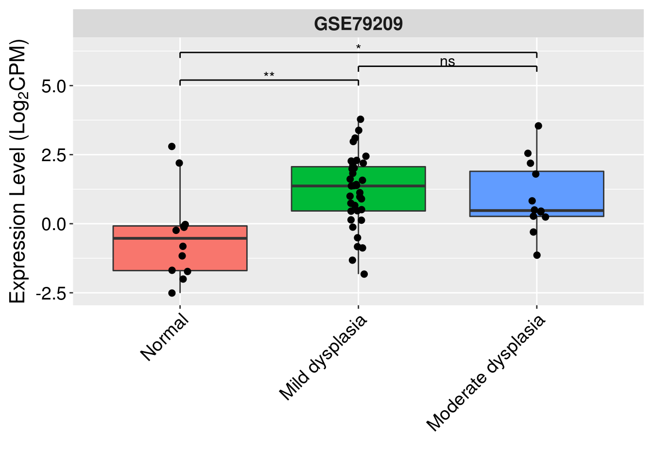
### Add stats automatically, 3 groups

## ggsignif(), can provide self-defined annotations, otherwise perform wilcox test by default

dataForBoxPlot <- readRDS('data/dataForBoxPlot.rds')

dataForBoxPlot <- filter(dataForBoxPlot,
                         HistologyGrade %in% c('Normal','Mild dysplasia','Moderate dysplasia'))

dataForBoxPlot$expr <- dataForBoxPlot$DSG3
dataForBoxPlot$group <- factor(dataForBoxPlot$HistologyGrade,
                               levels=c('Normal','Mild dysplasia','Moderate dysplasia'))

t <- pairwise.wilcox.test(dataForBoxPlot$expr, dataForBoxPlot$group,
                          p.adjust.method = 'none')

#t <- pairwise.t.test(dataForBoxPlot$expr, dataForBoxPlot$group,
#                     p.adjust.method = 'none')
#t$p.value

pValue <- c(t$p.value)[!is.na(c(t$p.value))]

wtq <- levels(dataForBoxPlot$group)
lis <- combn(wtq,2)
my_comparisons <- tapply(lis, rep(1:ncol(lis), each=nrow(lis)), function(i) i)
my_comparisons <- my_comparisons[c(1,2,3)]

my_annotations <- as.character(symnum(pValue, #corr = FALSE, na = FALSE,
                                      cutpoints = c(0, 0.001, 0.01, 0.05, 1),
                                      symbols = c("***",'**','*','ns')))


#my_annotations <- ifelse(pValue >= 0.01, paste0('p = ', formatC(pValue, digits = 2)),
# paste0('p = ', formatC(pValue, format = "e", digits = 2)))

ggplot(data=dataForBoxPlot, aes(x=group, y=expr)) +
  geom_boxplot(aes(fill=group),
               outlier.shape = NA, outlier.size = NA,#outlier.colour = 'black',
               outlier.fill = NA) +
  #geom_smooth(method='lm') +
  facet_wrap(~dataset) +
  geom_jitter(size=2, width=0.05, color='black') +
  labs(x='', y=expression('Expression Level (Log'[2]*'CPM)')) +
  #geom_segment(data=df,aes(x = x1, y = y1, xend = x2, yend = y2)) +
  geom_signif(annotations = my_annotations, # optional
              comparisons = my_comparisons,
              step_increase = 0.1,
              vjust=.2,
              colour='gray20',
              tip_length=0.015) + # 0
  theme(legend.position = 'none')+
  theme(axis.text = element_text(size=14,color='black'),
        axis.text.x = element_text(angle = 45, hjust = 1),
        axis.title = element_text(size=16)) +
  theme(strip.text = element_text(size=14, face='bold')) +
  theme(plot.margin =  margin(t = 0.25, r = 0.25, b = 0.25, l = 0.25, unit = "cm"))
### Flip coord, with/without boarder
# No boarder, single color
dataForBoxPlot <- readRDS('data/dataForBoxPlot.rds')
dataForBoxPlot$expr <- dataForBoxPlot$DSG3
dataForBoxPlot$group <- dataForBoxPlot$HistologyGrade

exprMean <- dataForBoxPlot %>% group_by(group) %>% summarise(meanExpr=mean(expr))

dataForBoxPlot$group <- factor(dataForBoxPlot$group,
                               levels=exprMean$group[order(exprMean$meanExpr, decreasing = F)])

ggplot(data=dataForBoxPlot, aes(x=group, y=expr)) +
  geom_boxplot(fill='#00AFBB',color='black', alpha=0.7,
               outlier.shape = NA, outlier.size = NA,#outlier.colour = 'black',
               outlier.fill = NA) +
  coord_flip() +
  geom_jitter(size=2, width = 0.1) +
  labs(x='Sample Type', y=expression('Expression Level (Log'[2]*'CPM)')) +
  theme_bw()+
  theme(legend.title = element_blank(),
        legend.position = 'none') +
  theme(axis.title.x =element_text(size=18, color='grey20'),
        axis.title.y =element_text(size=14, color='black'),
        axis.text = element_text(size=14),
        axis.text.x = element_text(angle = 0, hjust=0.5),
        strip.text = element_text(size=14)) +
  theme(panel.border = element_blank(),
        axis.ticks=element_blank(),
        axis.line = element_blank(),
        panel.background = element_blank()) +
  theme(plot.margin =  margin(t = 0.25, r = 0.25, b = 0.25, l = 0.25, unit = "cm"))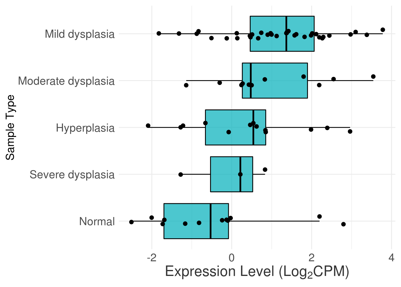
# Normal
dataForBoxPlot <- readRDS('data/dataForBoxPlot.rds')
dataForBoxPlot$expr <- dataForBoxPlot$DSG3
dataForBoxPlot$group <- dataForBoxPlot$HistologyGrade

exprMean <- dataForBoxPlot %>% group_by(group) %>% summarise(meanExpr=mean(expr))

dataForBoxPlot$group <- factor(dataForBoxPlot$group,
                               levels=exprMean$group[order(dataForBoxPlot[match(exprMean$group,                                                                    dataForBoxPlot$group),]$dataset,exprMean$meanExpr)])

ggplot(data=dataForBoxPlot, aes(x=group, y=expr)) +
  geom_boxplot(aes(fill=group),#size=0.5,
               outlier.shape = NA, outlier.size = NA,#outlier.colour = 'black',
               outlier.fill = NA, width=0.6) +
  coord_flip() +
  geom_jitter(size=2, width = 0.1) +
  #facet_wrap(~study, nrow=3, scales='free') +
  labs(x='', y=expression('Expression Level (Log'[2]*'CPM)')) +
  theme_bw()+
  theme(legend.title = element_blank(),
        legend.position = 'none') +
  #theme_set(theme_minimal()) #
  theme(axis.title=element_text(size=18),
        axis.text = element_text(color='black', size=14),
        axis.text.x = element_text(angle = 0, vjust=1),
        strip.text = element_text(size=14)) +
  theme(axis.line = element_line(colour = "black"),
        #panel.border = element_blank(),
        panel.background = element_blank()) +
  theme(plot.margin =  margin(t = 0.25, r = 0.25, b = 0.25, l = 0.25, unit = "cm"))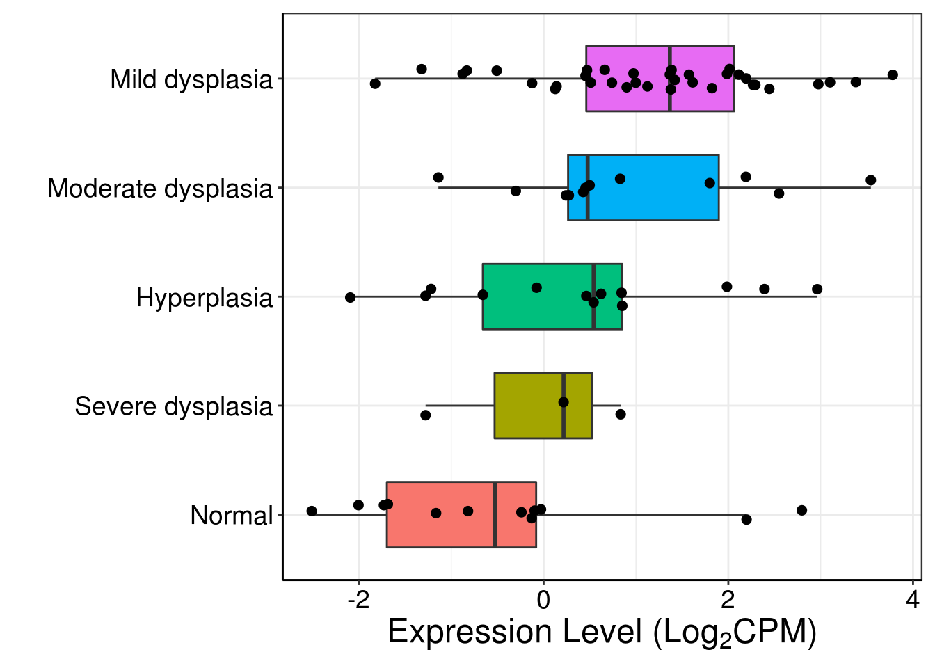
### Comparison within each group

dataForBoxPlot <- readRDS('data/dataForBoxPlot.rds')

dataForBoxPlot <- data.frame(expr=as.numeric(unlist(dataForBoxPlot[,1:5])),
                             group=rep(dataForBoxPlot$SampleType,5),
                             gene=rep(colnames(dataForBoxPlot)[1:5],each=nrow(dataForBoxPlot)),
                             stringsAsFactors = F)
dataForBoxPlot$group <- factor(dataForBoxPlot$group, levels=c('Normal','Dysplasia'))
dataForBoxPlot$gene <- factor(dataForBoxPlot$gene, levels=unique(dataForBoxPlot$gene))

#dataForBoxPlot <- dataForBoxPlot[-which(is.na(dataForBoxPlot$expr)),]
#dim(dataForBoxPlot)

# NOT WORKING UNLESS plyr IS UNLOADED
pValue <- dataForBoxPlot %>% group_by(gene) %>%
  do(test = wilcox.test(expr~group, data=., paired=FALSE)) %>%
  summarise(gene, pval = test$p.value)

pValue <- pValue$pval

my_annotations <- as.character(symnum(pValue, #corr = FALSE, na = FALSE,
                                      cutpoints = c(0, 0.001, 0.01, 0.05, 1),
                                      symbols = c("***",'**','*','ns')))

#my_annotations <- ifelse(pValue >= 0.01, paste0('p = ', formatC(pValue, digits = 2)),
# paste0('p = ', formatC(pValue, format = "e", digits = 2)))
#anno <- data.frame(x=1:5,y=17.5,label=my_annotations)

exprMax <- dataForBoxPlot %>% group_by(gene) %>% summarise(maxExpr=max(expr))

anno <- data.frame(x=exprMax$gene,y=exprMax$maxExpr+1,label=my_annotations,gene=exprMax$gene)
anno <- anno[which(anno$label!='ns'),]

p <- position_dodge(0.58)

bxplt <- ggplot(dataForBoxPlot, aes(x=gene, y=expr, group = interaction(group, gene)))
#fill=interaction(group,project))
#stat_boxplot(geom ='errorbar', width=0.5, position = position_dodge(width = 0.75))
#stat_summary(geom ='crossbar', width=0.5, color='white')

bxplt+geom_boxplot(aes(color=group, fill=group),
                   outlier.shape = 21, outlier.size = 1,#outlier.colour = 'black',
                   outlier.fill = NA, alpha=1, width=0.5,
                   position = p) +
  stat_summary(geom = "crossbar", width=0.45, fatten=0, color="white", position=p,
               fun.data = function(x){ return(c(y=median(x), ymin=median(x), ymax=median(x))) }) +
  #scale_fill_npg(palette = 'nrc', alpha = 0.5)+
  #scale_fill_manual(values=c('limegreen', 'blue'),
  #                  labels=c('Normal', 'Dysplasia'),
  #                  name='Sample type') +
  #geom_jitter(size=0.3)+
  labs(x='', y=expression('Expression Level (Log'[2]*'CPM)')) +
  #ylim(-5,20) +
  geom_text(data =anno, aes(x, y, label=label, group=NULL),
            size=5) +
  #geom_signif(annotations = my_annotations,
  #            y_position = rep(7.5,5),
  #            xmin = c(1,2,3,4,5)-0.15,
  #            xmax = c(1,2,3,4,5)+0.15,
  #            #comparisons = my_comparisons,
  #            step_increase = 0,
  #            vjust=.2,
  #            colour='gray20',
  #            tip_length=0) + # 0
  theme_bw()+
  theme(legend.title = element_blank(),
        legend.text = element_text(size=14),
        legend.position = 'right') +
  theme(axis.title=element_text(size=16),
        axis.text = element_text(color='black', size=14),
        axis.text.x = element_text(angle = 0, hjust=0.5)) +
  theme(axis.line = element_line(colour = "black"),
        panel.border = element_blank(),
        panel.background = element_blank()) +
  theme(plot.margin =  margin(t = 0.25, r = 0.25, b = 0.25, l = 0.25, unit = "cm"))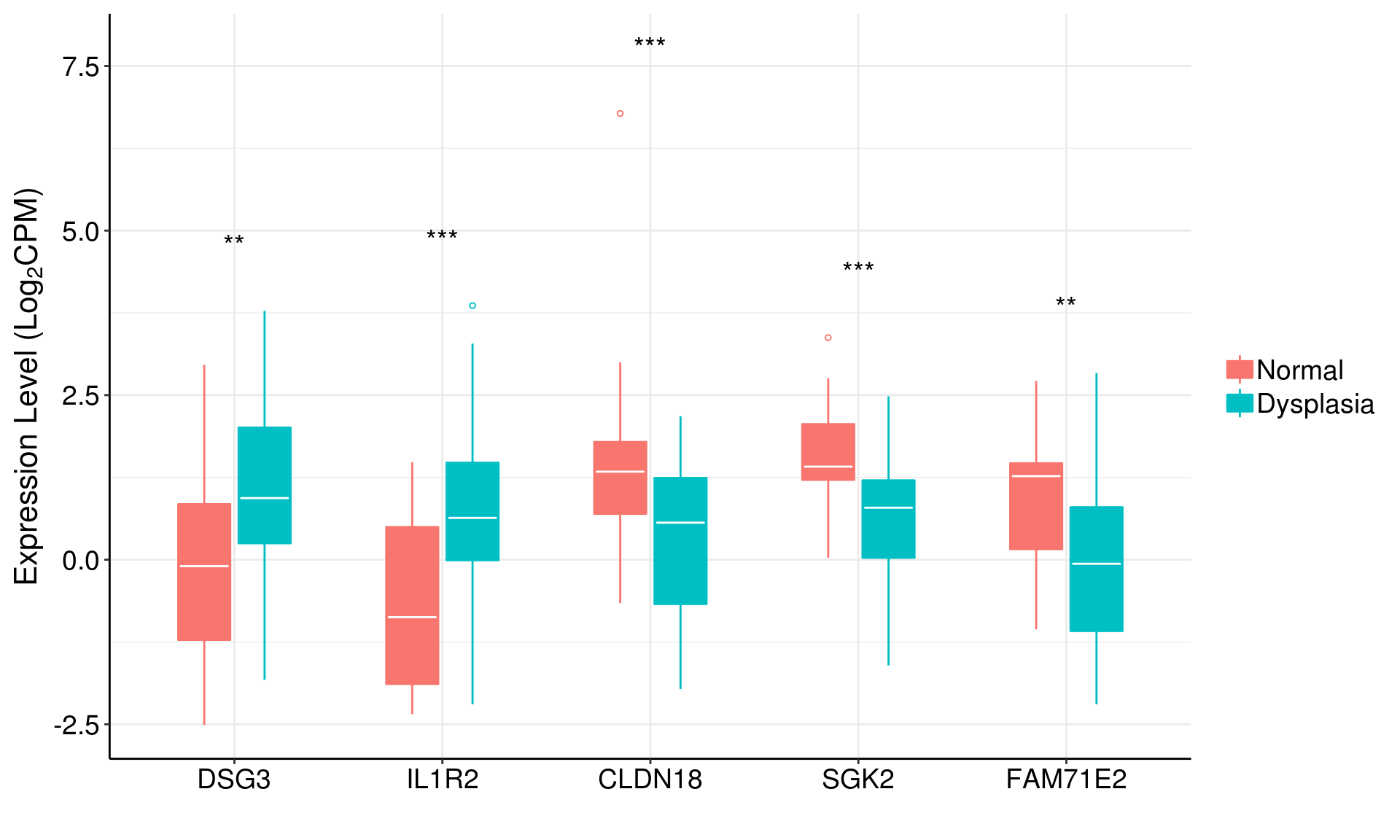
### Facet_wrap()
dataForBoxPlot <- readRDS('data/dataForBoxPlot.rds')

dataForBoxPlot <- data.frame(expr=as.numeric(unlist(dataForBoxPlot[,1:5])),
                             group=rep(dataForBoxPlot$SampleType,5),
                             gene=rep(colnames(dataForBoxPlot)[1:5],each=nrow(dataForBoxPlot)),
                             stringsAsFactors = F)
dataForBoxPlot$group <- factor(dataForBoxPlot$group, levels=c('Normal','Dysplasia'))
dataForBoxPlot$gene <- factor(dataForBoxPlot$gene, levels=unique(dataForBoxPlot$gene))

#dataForBoxPlot <- dataForBoxPlot[-which(is.na(dataForBoxPlot$expr)),]
#dim(dataForBoxPlot)

# NOT WORKING UNLESS plyr IS UNLOADED
pValue <- dataForBoxPlot %>% group_by(gene) %>%
  do(test = wilcox.test(expr~group, data=., paired=FALSE)) %>%
  summarise(gene, pval = test$p.value)

pValue <- pValue$pval

my_annotations <- as.character(symnum(pValue, #corr = FALSE, na = FALSE,
                                      cutpoints = c(0, 0.001, 0.01, 0.05, 1),
                                      symbols = c("***",'**','*','ns')))

#my_annotations <- ifelse(pValue >= 0.01, paste0('p = ', formatC(pValue, digits = 2)),
# paste0('p = ', formatC(pValue, format = "e", digits = 2)))
#anno <- data.frame(x=1:5,y=17.5,label=my_annotations)

exprMax <- dataForBoxPlot %>% group_by(gene) %>% summarise(maxExpr=max(expr))

anno <- data.frame(x=1.5,y=7.5,label=my_annotations,gene=exprMax$gene)
anno <- anno[which(anno$label!='ns'),]

ggplot(data=dataForBoxPlot, aes(x=group, y=expr)) +
  geom_boxplot(aes(fill=group),
               outlier.shape = NA, outlier.size = NA,#outlier.colour = 'black',
               outlier.fill = NA) +
  #geom_boxplot(aes(color=group, fill=group),
  #             outlier.shape = 21, outlier.size = 1,#outlier.colour = 'black',
  #             outlier.fill = NA, alpha=1, width=0.5) +
  #stat_summary(geom = "crossbar", width=0.45, fatten=0, color="white", position=p,
  #             fun.data = function(x){ return(c(y=median(x), ymin=median(x), ymax=median(x))) }) +
  facet_wrap(~gene, nrow=1) +
  geom_jitter(size=2, width=0.05, color='darkblue') +
  labs(x='', y=expression('Expression Level (Log'[2]*'CPM)')) +
  #geom_segment(data=df,aes(x = x1, y = y1, xend = x2, yend = y2)) +
  geom_text(data =anno, aes(x, y, label=label, group=NULL),
            size=5) +
  theme(legend.position = 'none')+
  theme(axis.text = element_text(size=14,color='black'),
        axis.text.x = element_text(angle = 45, hjust = 1),
        axis.title = element_text(size=16),
        strip.text = element_text(size=14, face='bold')) +
  theme(plot.margin =  margin(t = 0.25, r = 0.25, b = 0.25, l = 0.25, unit = "cm"))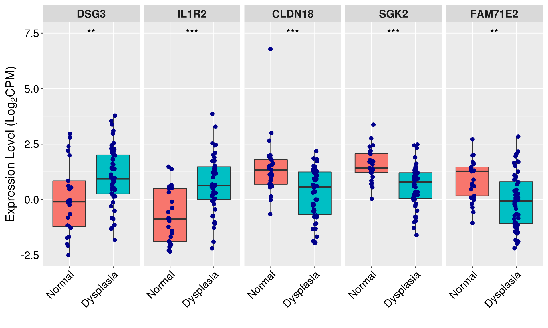
1.2 Barplot
### Normal
barData <- readRDS(file='data/dataForBarPlot.rds')

dataForBarPlot <- data.frame(expr=apply(barData, 1, function(x) mean(x, na.rm=T)),
                             sd = apply(barData, 1, function(x) sd(x, na.rm=T)),
                             cell=rownames(barData))

o <- order(apply(barData, 1, function(x) mean(x, na.rm=T)), decreasing = T)

dataForBarPlot$cell <- factor(dataForBarPlot$cell, levels=dataForBarPlot$cell[o])


ggplot(data=dataForBarPlot, aes(x=cell, y=expr), fill='black', color='black') +
  geom_bar(stat='identity', width=.8) + #coord_flip()
  #geom_errorbar(aes(ymin=expr, ymax=expr+sd), width=.2, size=0.5, #expr-sd
  #              position=position_dodge(.9)) +
  labs(x='', y=expression('Expression Level (TPM)')) +
  #scale_y_continuous(trans = 'sqrt',
  #                   breaks = c(0,2.5,50,250,750),
  #                   labels = c(0,2.5,50,250,750)) +
  #scale_y_sqrt() +
  #scale_y_continuous(trans='log2') +
  #scale_fill_manual(values = rep('black',nrow(dataForBarPlot))) +
  #scale_color_manual(values = rep('black',nrow(dataForBarPlot))) +
  theme_bw()+
  theme(legend.title = element_blank(),
        legend.text = element_text(size=14),
        legend.position = 'none') +
  theme(axis.title=element_text(size=16),
        axis.text = element_text(color='black', size=14),
        axis.text.x = element_text(angle = 45, hjust=1)) +
  theme(axis.line = element_line(colour = "black"),
        panel.border = element_blank(),
        panel.background = element_blank(),
        panel.grid = element_blank(),
        panel.grid.major = element_blank()) +
  theme(plot.margin =  margin(t = 0.25, r = 0.25, b = 0.25, l = 1, unit = "cm"))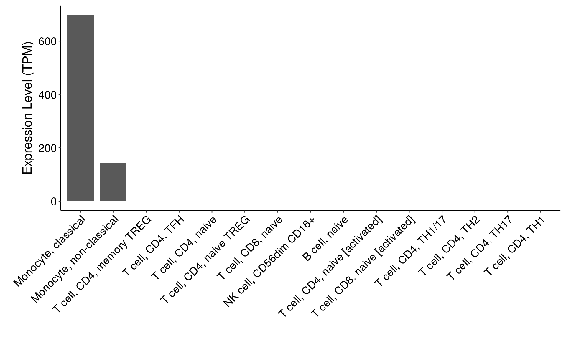
### Errorbar, axis transformation
barData <- readRDS(file='data/dataForBarPlot.rds')

dataForBarPlot <- data.frame(expr=apply(barData, 1, function(x) mean(x, na.rm=T)),
                             sd = apply(barData, 1, function(x) sd(x, na.rm=T)),
                             cell=rownames(barData))

o <- order(apply(barData, 1, function(x) mean(x, na.rm=T)), decreasing = T)

dataForBarPlot$cell <- factor(dataForBarPlot$cell, levels=dataForBarPlot$cell[o])


ggplot(data=dataForBarPlot, aes(x=cell, y=expr, fill=cell, color=cell)) +
  geom_bar(stat='identity', width=.6) + #coord_flip()
  geom_errorbar(aes(ymin=expr, ymax=expr+sd), width=.2, size=0.5, #expr-sd
                position=position_dodge(.9)) +
  labs(x='', y=expression('Expression Level (TPM)')) +
  scale_y_continuous(trans = 'sqrt',
                     breaks = c(0,2.5,50,250,750),
                     labels = c(0,2.5,50,250,750)) +
  #scale_y_sqrt() +
  #scale_y_continuous(trans='log2') +
  #scale_fill_manual(values = rep('black',nrow(dataForBarPlot))) +
  #scale_color_manual(values = rep('black',nrow(dataForBarPlot))) +
  theme_bw()+
  theme(legend.title = element_blank(),
        legend.text = element_text(size=14),
        legend.position = 'none') +
  theme(axis.title=element_text(size=16),
        axis.text = element_text(color='black', size=14),
        axis.text.x = element_text(angle = 45, hjust=1)) +
  theme(axis.line = element_line(colour = "black"),
        panel.border = element_blank(),
        panel.background = element_blank(),
        panel.grid = element_blank(),
        panel.grid.major = element_blank()) +
  theme(plot.margin =  margin(t = 0.25, r = 0.25, b = 0.25, l = 1, unit = "cm"))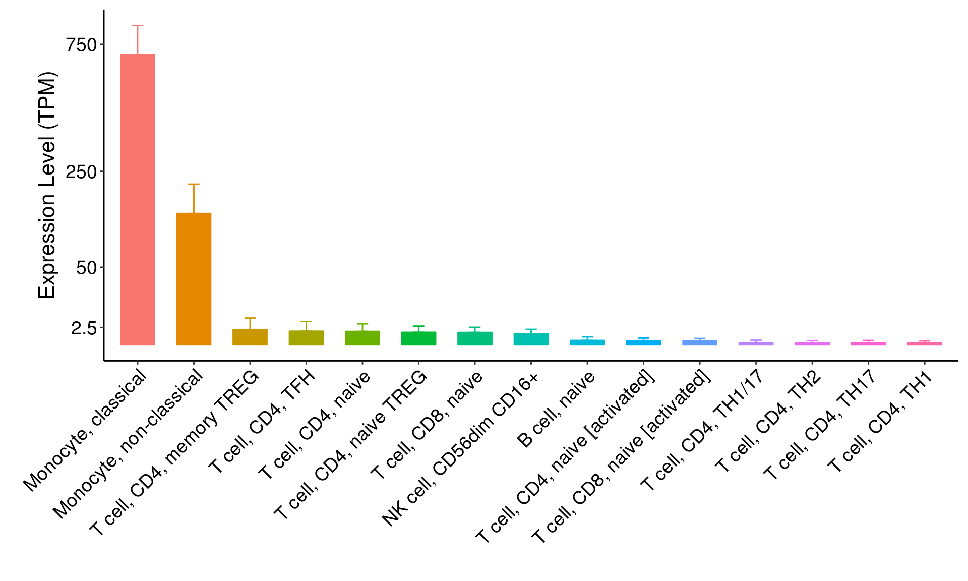
### errorbar, both side
barData <- readRDS(file='data/dataForBarPlot.rds')

dataForBarPlot <- data.frame(expr=apply(barData, 1, function(x) mean(x, na.rm=T)),
                             sd = apply(barData, 1, function(x) sd(x, na.rm=T)),
                             cell=rownames(barData))

o <- order(apply(barData, 1, function(x) mean(x, na.rm=T)), decreasing = T)

dataForBarPlot$cell <- factor(dataForBarPlot$cell, levels=dataForBarPlot$cell[o])

ggplot(data=dataForBarPlot, aes(x=cell, y=expr, fill=cell)) +
  geom_bar(stat='identity', width=.6) + #coord_flip()
  geom_errorbar(aes(ymin=expr-sd, ymax=expr+sd), width=.2, size=0.5, #expr-sd
                position=position_dodge(.9)) +
  labs(x='', y=expression('Expression Level (TPM)')) +
  #scale_y_continuous(trans = 'sqrt',
  #                   breaks = c(0,2.5,50,250,750),
  #                   labels = c(0,2.5,50,250,750)) +
  #scale_y_sqrt() +
  #scale_y_continuous(trans='log2') +
  #scale_fill_manual(values = rep('black',nrow(dataForBarPlot))) +
  #scale_color_manual(values = rep('black',nrow(dataForBarPlot))) +
  theme_bw()+
  theme(legend.title = element_blank(),
        legend.text = element_text(size=14),
        legend.position = 'none') +
  theme(axis.title=element_text(size=16),
        axis.text = element_text(color='black', size=14),
        axis.text.x = element_text(angle = 45, hjust=1)) +
  theme(axis.line = element_line(colour = "black"),
        panel.border = element_blank(),
        panel.background = element_blank(),
        panel.grid = element_blank(),
        panel.grid.major = element_blank()) +
  theme(plot.margin =  margin(t = 0.25, r = 0.25, b = 0.25, l = 1, unit = "cm"))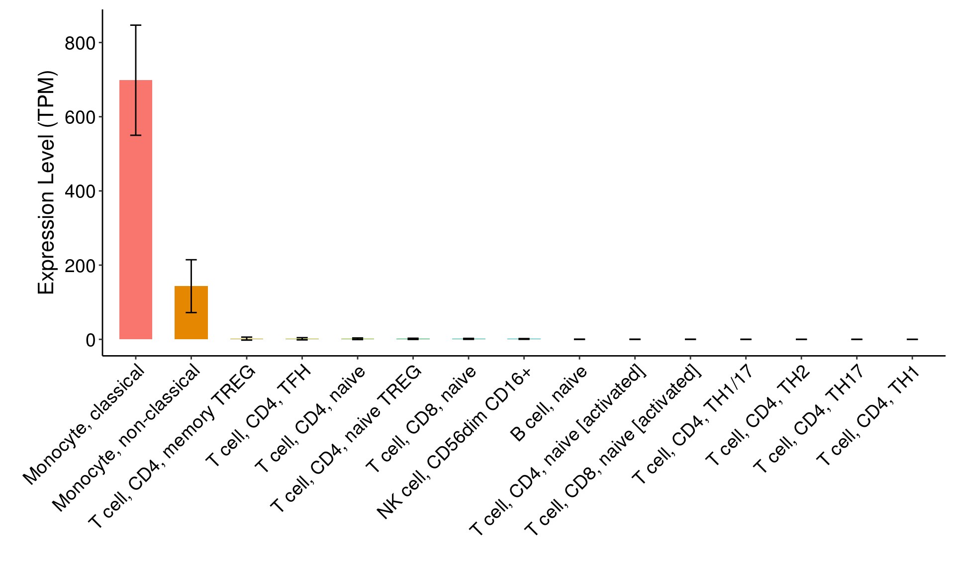
# with negative values

barData <- readRDS(file='data/dataForBarPlot_Negative.rds')

dataForBarPlot <- barData %>% group_by(Subtype) %>% summarise(expr=mean(Exprs), sd=sd(Exprs))
dataForBarPlot
## # A tibble: 53 x 3
## Subtype expr sd
## <chr> <dbl> <dbl>
## 1 Adipose - Subcutaneous 3.03 1.29
## 2 Adipose - Visceral (Omentum) 4.00 1.75
## 3 Adrenal Gland 2.53 1.17
## 4 Artery - Aorta 3.53 1.42
## 5 Artery - Coronary 3.46 1.57
## 6 Artery - Tibial 2.48 1.27
## 7 Bladder 2.48 1.09
## 8 Brain - Amygdala 0.909 1.80
## 9 Brain - Anterior cingulate cortex (BA24) 0.488 1.59
## 10 Brain - Caudate (basal ganglia) 1.08 1.65
## # … with 43 more rowso <- order(dataForBarPlot$expr, decreasing = F)
dataForBarPlot$Subtype <- factor(dataForBarPlot$Subtype, levels=dataForBarPlot$Subtype[o])
# colors
ggplot(data=dataForBarPlot, aes(x=Subtype, y=expr, fill=Subtype, color=Subtype)) +
geom_bar(stat='identity', width=.6) + #coord_flip()
geom_errorbar(aes(ymin=ifelse(expr>0, expr, expr-sd),
ymax=ifelse(expr>0, expr+sd, expr)),
width=.5, size=0.5,
position=position_dodge(.9)) +
labs(x='', y='mRNA Level (TPM)') +
#scale_y_continuous(trans = 'sqrt',
# breaks = c(0,2.5,50,250,750),
# labels = c(0,2.5,50,250,750)) +
#scale_y_sqrt() +
#scale_y_continuous(trans='log2') +
#scale_fill_manual(values = rep('black',nrow(dataForBarPlot))) +
#scale_color_manual(values = rep('black',nrow(dataForBarPlot))) +
theme_bw()+
theme(legend.title = element_blank(),
legend.text = element_text(size=14),
legend.position = 'none') +
theme(axis.title=element_text(size=16),
axis.text = element_text(color='black', size=14),
axis.text.x = element_text(angle = 45, hjust=1)) +
theme(axis.line = element_line(colour = "black"),
panel.border = element_blank(),
panel.background = element_blank(),
panel.grid = element_blank(),
panel.grid.major = element_blank()) +
theme(plot.margin = margin(t = 0.25, r = 0.25, b = 0.25, l = 1, unit = "cm"))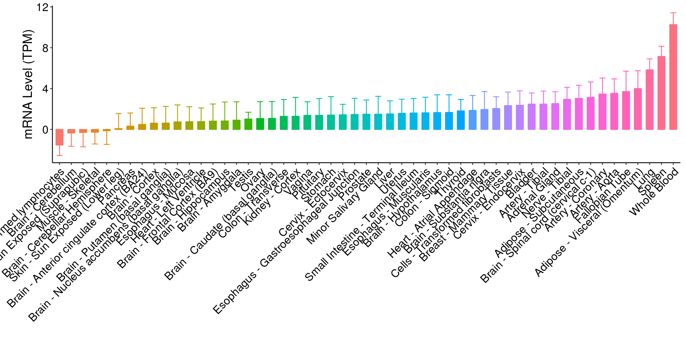
# black
ggplot(data=dataForBarPlot, aes(x=Subtype, y=expr)) +
  geom_bar(stat='identity', width=.6) + #coord_flip()
  geom_errorbar(aes(ymin=ifelse(expr>0, expr, expr-sd),
                    ymax=ifelse(expr>0, expr+sd, expr)),
                width=.5, size=0.5,
                position=position_dodge(.9)) +
  labs(x='', y='mRNA Level (TPM)') +
  #scale_y_continuous(trans = 'sqrt',
  #                   breaks = c(0,2.5,50,250,750),
  #                   labels = c(0,2.5,50,250,750)) +
  #scale_y_sqrt() +
  #scale_y_continuous(trans='log2') +
  #scale_fill_manual(values = rep('dodgerblue',nrow(dataForBarPlot))) +
  #scale_color_manual(values = rep('black',nrow(dataForBarPlot))) +
  theme_bw()+
  theme(legend.title = element_blank(),
        legend.text = element_text(size=14),
        legend.position = 'none') +
  theme(axis.title=element_text(size=16),
        axis.text = element_text(color='black', size=14),
        axis.text.x = element_text(angle = 45, hjust=1)) +
  theme(axis.line = element_line(colour = "black"),
        panel.border = element_blank(),
        panel.background = element_blank(),
        panel.grid = element_blank(),
        panel.grid.major = element_blank()) +
  theme(plot.margin =  margin(t = 0.25, r = 0.25, b = 0.25, l = 1, unit = "cm"))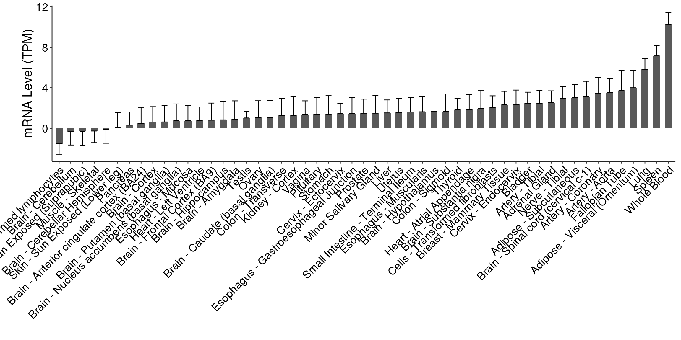
###
ggplot(data=dataForBarPlot, aes(x=Subtype, y=expr, fill=Subtype)) +
  geom_bar(stat='identity', width=.6) + #coord_flip()
  geom_errorbar(aes(ymin=expr-sd,
                    ymax=expr+sd),
                width=.5, size=0.5,
                position=position_dodge(.9)) +
  labs(x='', y='mRNA Level (TPM)') +
  #scale_y_continuous(trans = 'sqrt',
  #                   breaks = c(0,2.5,50,250,750),
  #                   labels = c(0,2.5,50,250,750)) +
  #scale_y_sqrt() +
  #scale_y_continuous(trans='log2') +
  scale_fill_manual(values = rep('dodgerblue',nrow(dataForBarPlot))) +
  #scale_color_manual(values = rep('black',nrow(dataForBarPlot))) +
  theme_bw()+
  theme(legend.title = element_blank(),
        legend.text = element_text(size=14),
        legend.position = 'none') +
  theme(axis.title=element_text(size=16),
        axis.text = element_text(color='black', size=14),
        axis.text.x = element_text(angle = 45, hjust=1)) +
  theme(axis.line = element_line(colour = "black"),
        panel.border = element_blank(),
        panel.background = element_blank(),
        panel.grid = element_blank(),
        panel.grid.major = element_blank()) +
  theme(plot.margin =  margin(t = 0.25, r = 0.25, b = 0.25, l = 1, unit = "cm"))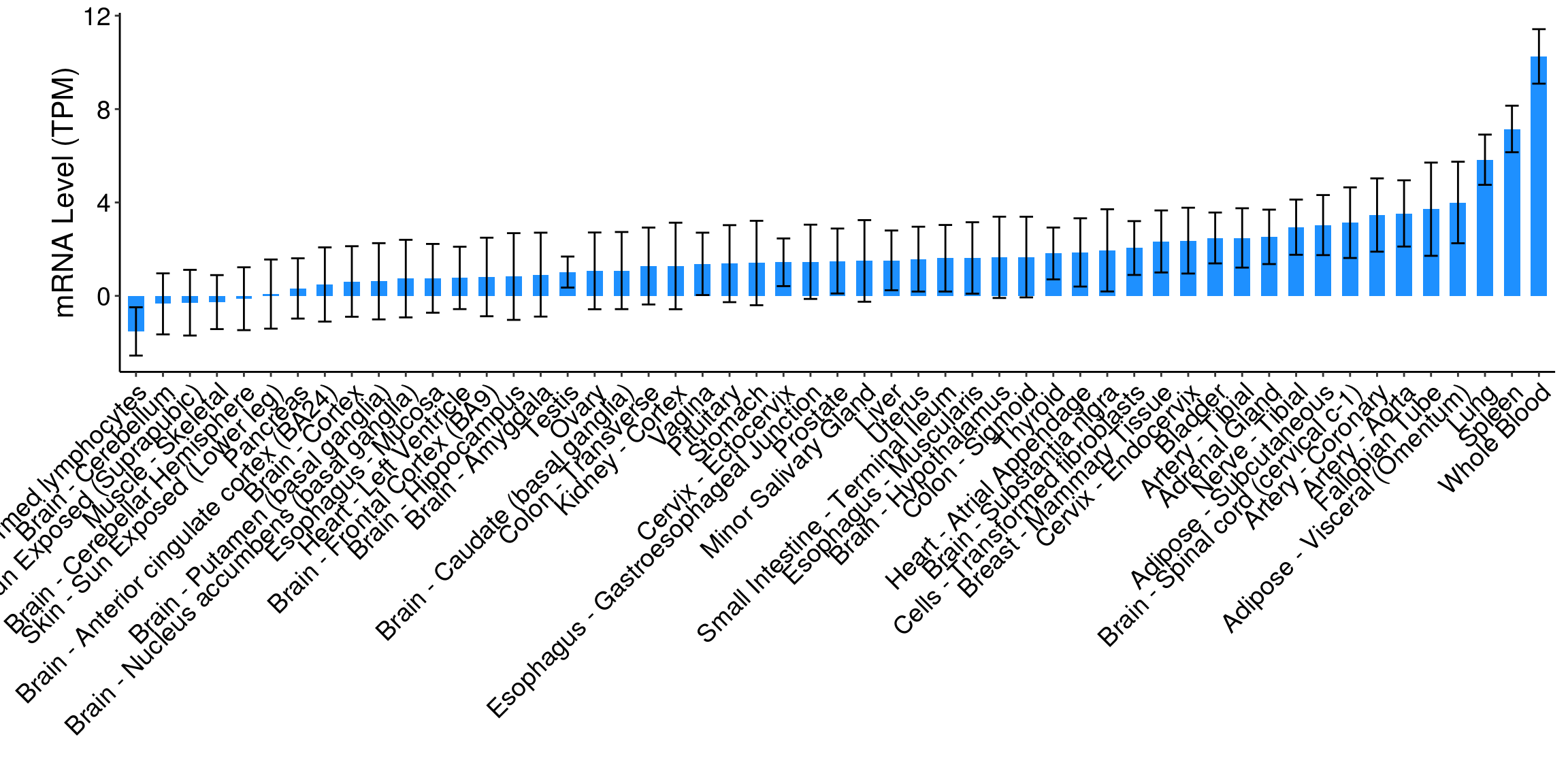
### Multiple groups, Gene Ontology, GO

dataForBarPlot <- readRDS('data/dataForBarPlot_GO.rds')
dataForBarPlot <- dataForBarPlot[dataForBarPlot$PValue<0.05,]
dataForBarPlot$Category <- factor(dataForBarPlot$Category, levels=c('BP','CC','MF'))

ggplot(data=dataForBarPlot, mapping=aes(x=Term, y=-log10(PValue), fill=Category)) +
  geom_bar(stat='identity') +
  scale_x_discrete(limits=dataForBarPlot$Term) +
  ylim(0, max(-log10(dataForBarPlot$PValue))) +
  labs(x='', y=expression('-log'[10]*'(P Value)')) + #coord_flip() +
  #scale_fill_hue(name='',breaks=kegg$Regulation,
  #               labels=kegg$Regulation) +
  #scale_fill_manual(values = c('orange','dodgerblue')) +
  scale_fill_manual(values=c('darkblue','darkgreen','darkred'),
                    labels=c('Biological Process','Cellular Component','Molecular Function')) +
  #geom_text(aes(label=Count), vjust=-0.1, size=4) +
  theme_bw()+theme(axis.line = element_line(colour = "black"),
                   panel.grid.major = element_blank(),
                   panel.grid.minor = element_blank(),
                   panel.border = element_rect(colour='white'),
                   panel.background = element_blank()) +
  theme(axis.text=element_text(size=12, color='black'),
        axis.text.x = element_text(angle=45, hjust=1),
        axis.title=element_text(size=16)) +
  theme(legend.text = element_text(size=12),
        legend.title = element_blank(),
        legend.position = 'right') +
  theme(plot.margin =  margin(t = 0.25, r = 0.25, b = 0.25, l = 4.5, unit = "cm"))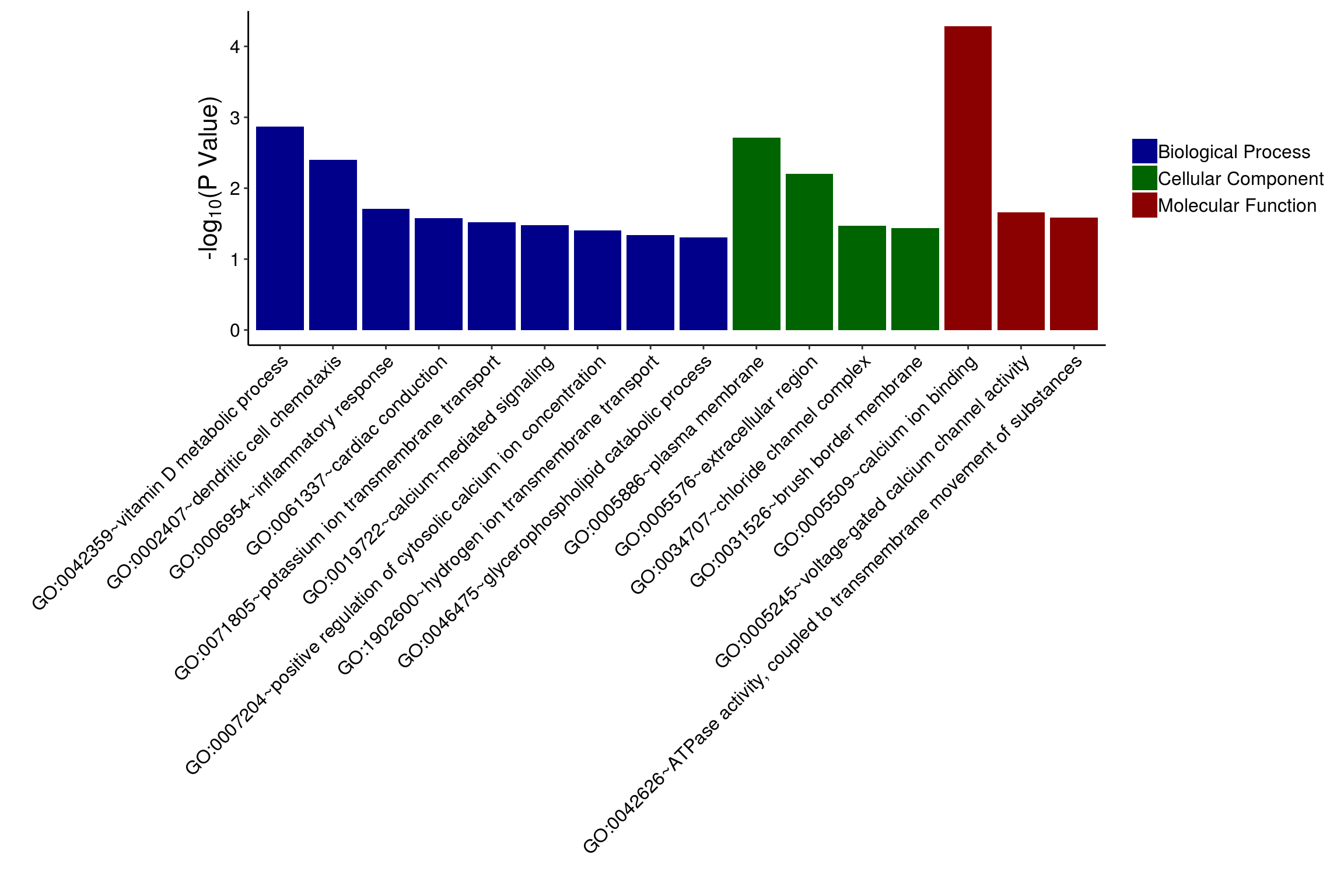
### coord_flip(), KEGG

dataForBarPlot <- readRDS('data/dataForBarPlot_KEGG.rds')

ggplot(data=dataForBarPlot, mapping=aes(x=Term, y=-log10(PValue),
                                        fill=Regulation)) +
  geom_bar(stat='identity') +
  scale_x_discrete(limits=rev(dataForBarPlot$Term)) +
  ylim(0, max(-log10(dataForBarPlot$PValue))) +
  labs(x='', y=expression('-log'[10]*'(P Value)')) + coord_flip() +
  #scale_fill_hue(name='',breaks=kegg$Regulation,
  #               labels=kegg$Regulation) +
  #scale_fill_manual(values = c('orange','dodgerblue')) +
  scale_fill_manual(values=c('black'))+#,breaks=kegg$Reg) +
  #geom_text(aes(label=Count), hjust=1, size=4.5) +
  theme_bw()+theme(axis.line = element_line(colour = "black"),
                   panel.grid.major = element_blank(),
                   panel.grid.minor = element_blank(),
                   panel.border = element_rect(colour='white'),
                   panel.background = element_blank()) +
  theme(axis.text=element_text(size=14, color='black'),
        axis.title=element_text(size=16)) +
  theme(legend.text = element_text(size=14),
        legend.title = element_blank(),
        legend.position = 'none')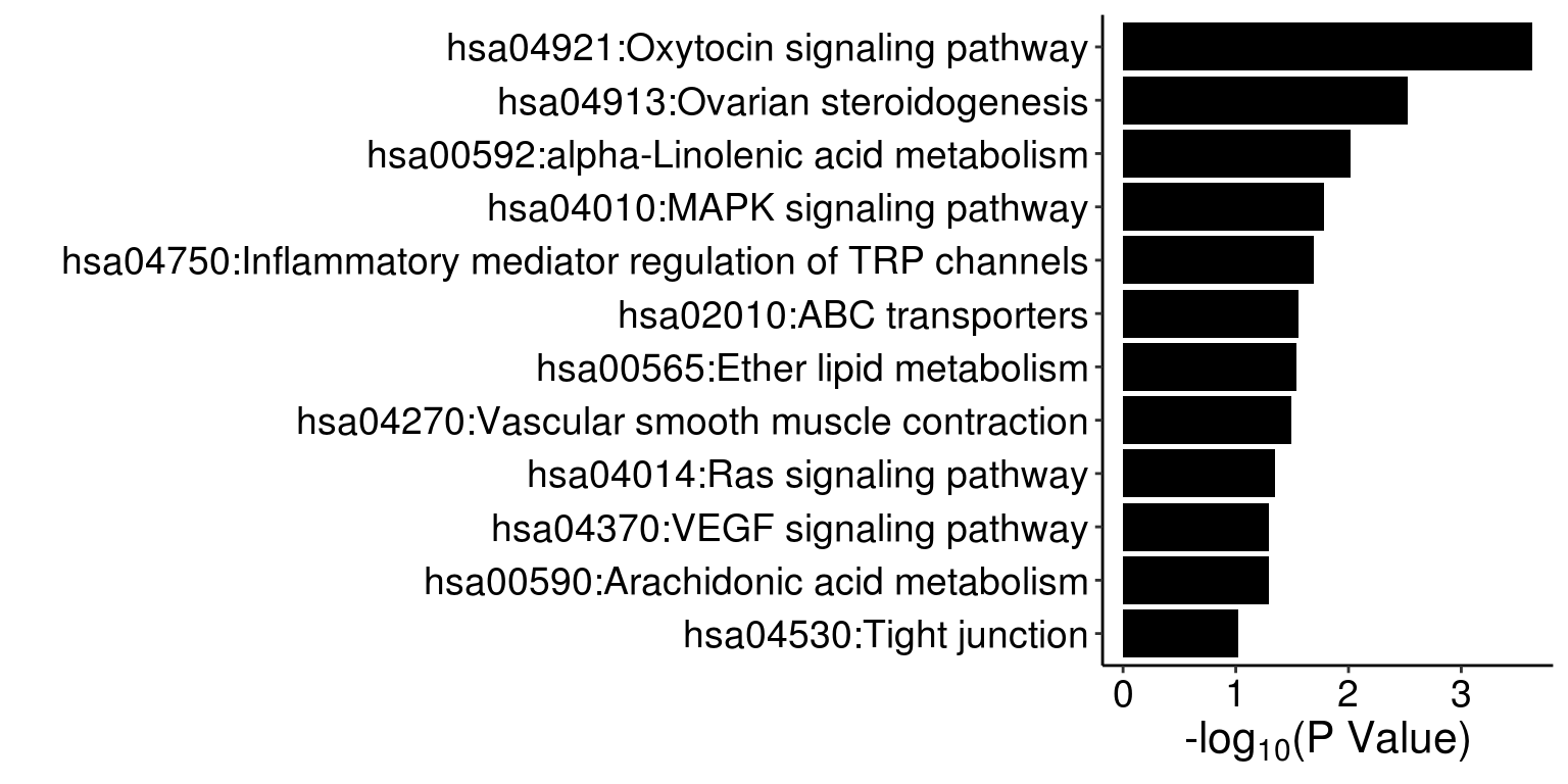
### add counts
ggplot(data=dataForBarPlot, mapping=aes(x=Term, y=-log10(PValue),
                                        fill=Regulation)) +
  geom_bar(stat='identity') +
  scale_x_discrete(limits=rev(dataForBarPlot$Term)) +
  ylim(0, max(-log10(dataForBarPlot$PValue))) +
  labs(x='', y=expression('-log'[10]*'(P Value)')) + coord_flip() +
  #scale_fill_hue(name='',breaks=kegg$Regulation,
  #               labels=kegg$Regulation) +
  #scale_fill_manual(values = c('orange','dodgerblue')) +
  scale_fill_manual(values=c('chocolate'))+#,breaks=kegg$Reg) +
  geom_text(aes(label=Count), hjust=1, size=5) +
  theme_bw()+theme(axis.line = element_line(colour = "black"),
                   panel.grid.major = element_blank(),
                   panel.grid.minor = element_blank(),
                   panel.border = element_rect(colour='white'),
                   panel.background = element_blank()) +
  theme(axis.text=element_text(size=14, color='black'),
        axis.title=element_text(size=16)) +
  theme(legend.text = element_text(size=14),
        legend.title = element_blank(),
        legend.position = 'none')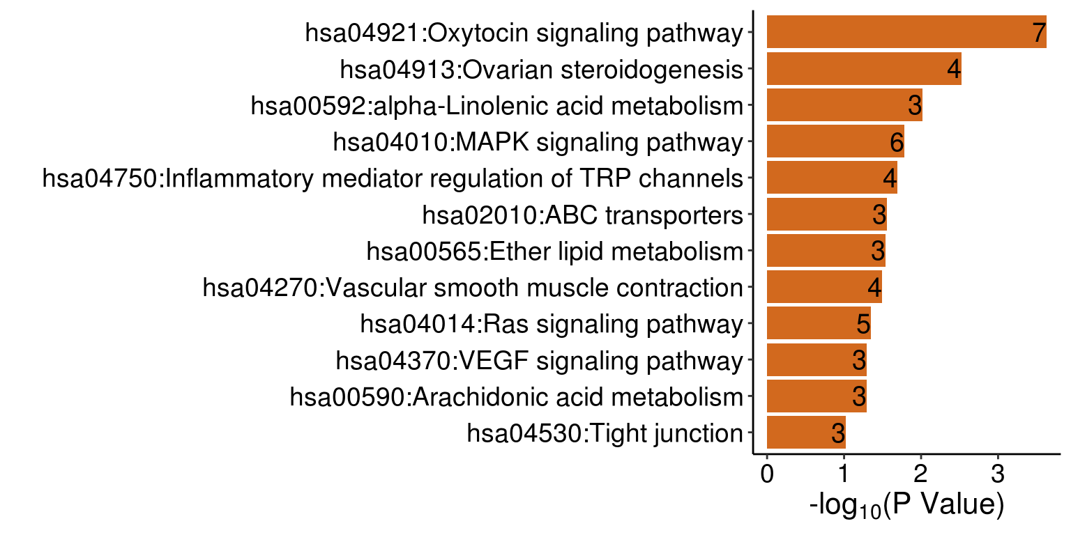
### Axis position

ggplot(data=dataForBarPlot, mapping=aes(x=Term, y=-log10(PValue), fill='darkred')) +
  geom_bar(stat='identity') +
  scale_x_discrete(limits=rev(dataForBarPlot$Term),
                   expand=c(0.05,0)) +
  scale_y_continuous(position='right', limits = c(0,4), breaks = c(0,1,2,3,4),
                     expand = c(0, 0)) +
  #ylim(0, max(-log(keggForPlot$Benjamini,10))) +
  labs(x='', y=expression('-log'[10]*'(P Value)')) + coord_flip() +
  #scale_fill_hue(name='',breaks=kegg$Regulation,
  #               labels=kegg$Regulation) +
  scale_fill_manual(values = c('darkred', 'dodgerblue')) +
  #geom_text(aes(label=Count), hjust=1, size=4) +
  theme_bw()+theme(axis.line = element_line(colour = "black"),
                   panel.grid.major = element_blank(),
                   panel.grid.minor = element_blank(),
                   panel.border = element_rect(colour='white'),
                   panel.background = element_blank()) +
  theme(axis.text=element_text(size=12, color='black'),
        axis.ticks.length = unit(0.2,'cm'),
        axis.ticks.y=element_blank(),
        axis.line.y = element_blank(),
        axis.title.x =element_text(size=14))+#,
  #axis.title.y = element_text(vjust = -2, hjust=1.1, size=12, angle = 0)) +
  theme(legend.text = element_text(size=14),
        legend.title = element_blank(),
        legend.position = 'none') +
  theme(plot.margin =  margin(t = 0.25, r = 0.5, b = 0.25, l = 0.25, unit = "cm"))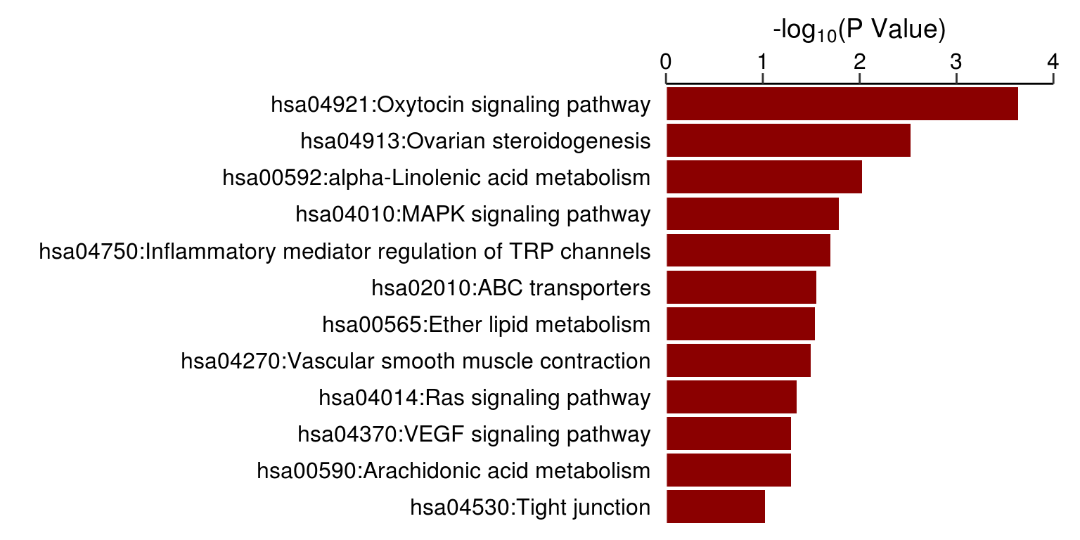
### Back to back

# normal

barData <- readRDS(file='data/dataForBarPlot_TCGA.rds')

barData <- barData[barData$Program=='TCGA',]

dataForBarPlot <- data.frame(Size=c(barData$Seq, barData$Exp),
                             Project=rep(barData$Project,2),
                             Type=rep(c('Seq','Exp'),nrow(barData)),
                             stringsAsFactors = F)


dataForBarPlot$Size <- ifelse(dataForBarPlot$Type=='Seq',dataForBarPlot$Size, dataForBarPlot$Size*-1)

o <- order(dataForBarPlot$Size[dataForBarPlot$Type=='Seq'], decreasing = T)

dataForBarPlot$Project <- factor(dataForBarPlot$Project,
                                 levels=dataForBarPlot$Project[dataForBarPlot$Type=='Seq'][o])


ggplot(dataForBarPlot,aes(y = Size, x = Project, fill = Type)) +
  geom_bar(stat="identity", width = 0.8) + #,position=position_dodge(0.58)
  labs(x='', y='Number of Samples') +
  coord_flip() + #scale_x_discrete(limits=rev(levels(dataForBarPlot$Tissue))) +
  #facet_grid(Category ~ .) + #, scales = "free"
  #ylim(0,30) +
  #scale_fill_manual(values=fill) +
  scale_y_continuous(breaks=seq(-1000,1000,500), labels = abs(seq(-1000,1000,500))) +
  theme_bw()+theme(axis.line = element_line(colour = "black"),
                   panel.grid.major = element_blank(),
                   panel.grid.minor = element_blank(),
                   panel.border = element_rect(colour='white'),
                   panel.background = element_blank()) +
  theme(axis.text=element_text(size=14, color='black'),
        axis.text.x =element_text(size=14, angle = 0, color='black', hjust = 0),
        axis.title.y =element_blank(), # flip x, y
        axis.title.x =element_text(size=16),
        strip.text = element_text(face = 'bold', size=12)) +
  theme(legend.text = element_text(size=12),
        legend.title = element_blank(),
        legend.position = 'top') +
  theme(plot.margin =  margin(t = 0.25, r = 0.5, b = 0.25, l = 0.25, unit = "cm"))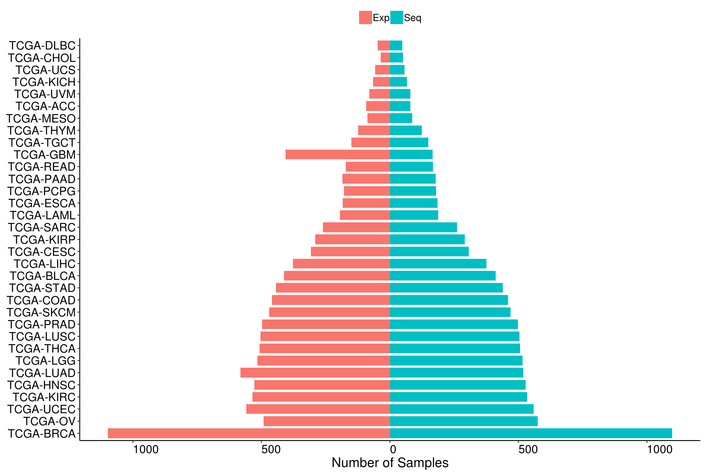
### Side by side

# single
barData <- readRDS('data/dataForBarPlot_TCGA.rds')

barData <- barData[barData$Program=='TCGA',]

dataForBarPlot <- data.frame(Size=c(barData$Seq, barData$Exp),
                             Project=rep(barData$Project,2),
                             Type=rep(c('Seq','Exp'),each=nrow(barData)),
                             stringsAsFactors = F)

#dataForBarPlot$Size <- ifelse(dataForBarPlot$Type=='Seq',dataForBarPlot$Size, dataForBarPlot$Size*-1)

o <- order(dataForBarPlot$Size[dataForBarPlot$Type=='Seq'], decreasing = T)

dataForBarPlot$Project <- factor(dataForBarPlot$Project,
                                 levels=dataForBarPlot$Project[dataForBarPlot$Type=='Seq'][o])

ggplot(dataForBarPlot, aes(y = Size, x = Project, fill = Type)) +
  geom_bar(stat="identity", width=0.8, position='dodge') +
  #geom_text(aes(y = pos, x = pathway, label = paste0(percentage, "%")),
  #           data = dataForPlot) +
  labs(x='', y='Number of Samples') +
  #facet_grid(Category ~ .) + #, scales = "free"
  #ylim(0,30) +
  #scale_fill_manual(values=fill) +
  #scale_y_continuous(labels = dollar_format(suffix = "%", prefix = "")) +
  theme_bw()+theme(axis.line = element_line(colour = "black"),
                   panel.grid.major = element_blank(),
                   panel.grid.minor = element_blank(),
                   panel.border = element_rect(colour='white'),
                   panel.background = element_blank()) +
  theme(axis.text=element_text(size=14, color='black'),
        axis.text.x =element_text(size=14, angle = 45, color='black', hjust = 1),
        axis.title.x =element_blank(),
        axis.title.y =element_text(size=16),
        strip.text = element_text(face = 'bold', size=12)) +
  theme(legend.text = element_text(size=12),
        legend.title = element_blank(),
        legend.position = 'top') +
  theme(plot.margin =  margin(t = 0.25, r = 0.5, b = 0.25, l = 0.25, unit = "cm"))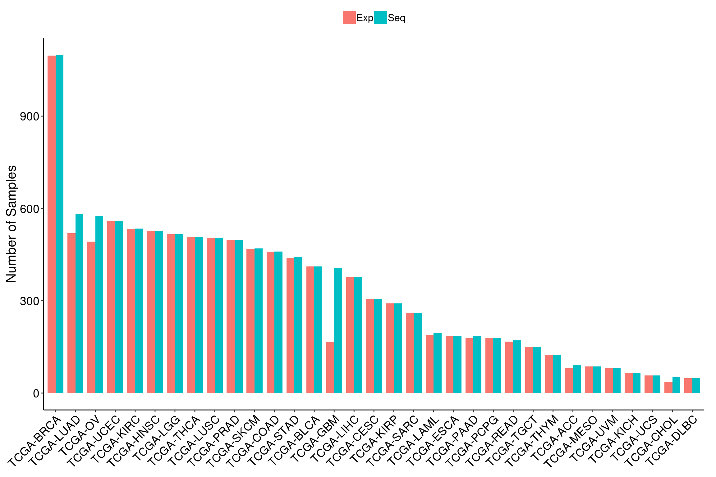
# side by side, multiple
barData <- readRDS('data/dataForBarPlot_TCGA.rds')

dataForBarPlot <- data.frame(Size=c(barData$Seq, barData$Exp),
                             Project=rep(barData$Project,2),
                             Type=rep(c('Seq','Exp'),each=nrow(barData)),
                             Program=rep(barData$Program,2),
                             stringsAsFactors = F)

o <- order(dataForBarPlot[dataForBarPlot$Type=='Seq',]$Program,
           dataForBarPlot[dataForBarPlot$Type=='Seq',]$Size,
           decreasing = T)

dataForBarPlot$Project <- factor(dataForBarPlot$Project,
                                 levels = dataForBarPlot[dataForBarPlot$Type=='Seq',]$Project[o])

dataForBarPlot$Program <- factor(dataForBarPlot$Program, levels=c('TCGA','TARGET'))


ggplot(dataForBarPlot, aes(y = Size, x = Project, fill = Type)) +
  geom_bar(stat="identity", width=0.8, position='dodge') +
  #geom_text(aes(y = pos, x = pathway, label = paste0(percentage, "%")),
  #           data = dataForPlot) +
  labs(x='', y='Number of Samples') +
  facet_wrap(~Program, scales='free', nrow=2) + #, scales = "free"
  #ylim(0,80) +
  #scale_fill_manual(values=fill) +
  #scale_y_continuous(labels = dollar_format(suffix = "%", prefix = "")) +
  theme_bw()+theme(axis.line = element_line(colour = "black"),
                   panel.grid.major = element_blank(),
                   panel.grid.minor = element_blank(),
                   panel.border = element_rect(colour='black'),
                   panel.background = element_blank()) +
  theme(axis.text=element_text(size=14, color='black'),
        axis.text.x =element_text(size=14, angle = 45, color='black', hjust = 1),
        axis.title.x =element_blank(),
        axis.title.y =element_text(size=16),
        strip.text = element_text(face = 'bold', size=12)) +
  theme(legend.text = element_text(size=12),
        legend.title = element_blank(),
        legend.position = 'top') +
  theme(plot.margin =  margin(t = 0.25, r = 0.5, b = 0.25, l = 0.25, unit = "cm"))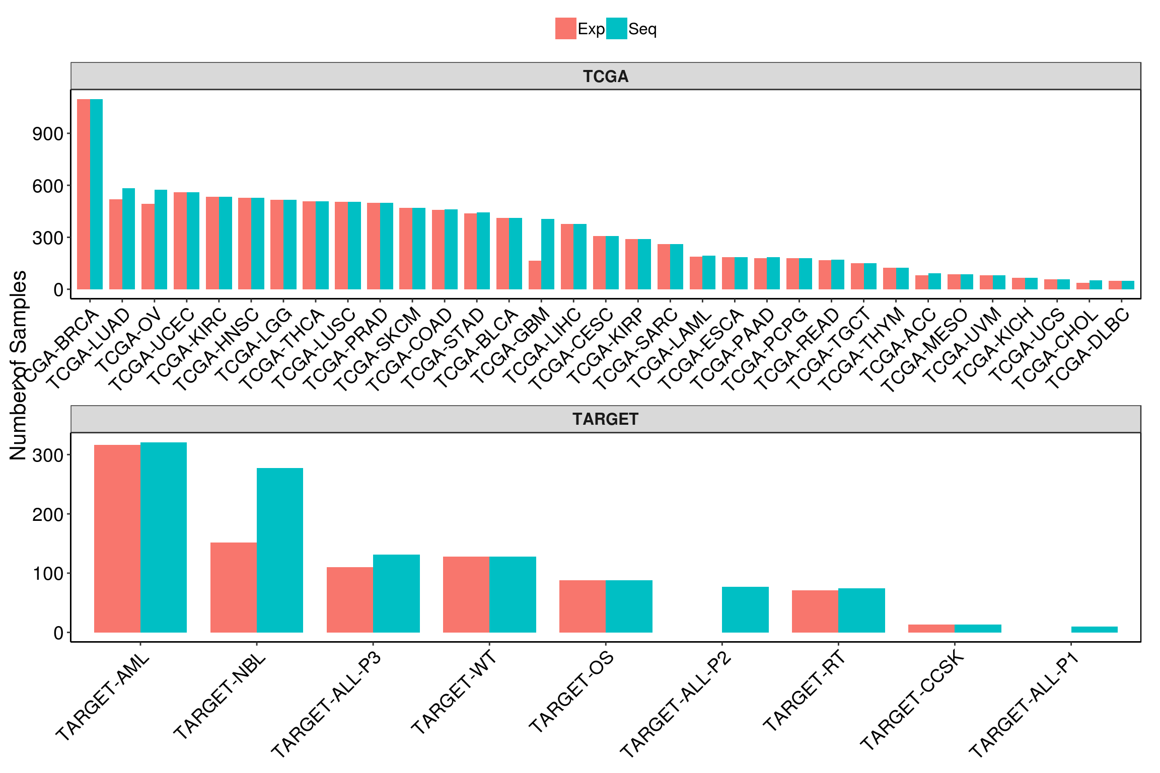
# multiple

dataForBarPlot <- readRDS('data/dataForBarPlot_PDX.rds')
dataForBarPlot <- dataForBarPlot[with(dataForBarPlot, order(CANCER.TYPE, LOG2.FPKM.)),]
dataForBarPlot$PDX.MODEL <- factor(dataForBarPlot$PDX.MODEL, levels = dataForBarPlot$PDX.MODEL)

idx <- which(! 1:length(dataForBarPlot$CANCER.TYPE) %in% which(duplicated(dataForBarPlot$CANCER.TYPE)))

colors = c('red','orange','yellow','springgreen','royalblue','cyan','purple','pink',
           'tomato', 'chocolate','goldenrod','yellowgreen','dodgerblue','turquoise',
           'mediumorchid','hotpink','brown','coral','khaki','limegreen','skyblue',
           'aquamarine','magenta','tan','blue','seagreen','violet','maroon','peru')

ggplot(data=dataForBarPlot, aes(x=PDX.MODEL, y=LOG2.FPKM., fill=CANCER.TYPE, color=CANCER.TYPE)) +
  geom_bar(stat='identity', width=0.01) + #coord_flip()
  #geom_errorbar(aes(ymin=expr, ymax=expr+sd), width=.2, size=0.5, #expr-sd
  #              position=position_dodge(.9)) +
  labs(x='', y=expression('Gene Expression (Log'[2]*'FPKM)'))+#, title='FPR1 Expresion (Microarray)') +
  scale_x_discrete(breaks = dataForBarPlot$PDX.MODEL[idx]) +
  scale_fill_manual(values = colors) +
  scale_color_manual(values = colors) +
  theme_bw()+
  #scale_y_continuous(trans = 'sqrt',
  #                   breaks = c(0,2.5,50,250,750),
  #                   labels = c(0,2.5,50,250,750)) +
  #scale_y_sqrt() +
  #scale_y_continuous(trans='log2') +
  ylim(-2,6)+
  theme(legend.title = element_blank(),
        legend.text = element_text(size=12),
        legend.position = 'bottom') +
  theme(axis.title=element_text(size=16),
        axis.text.x = element_blank(),
        axis.text.y = element_text(size=14)) +
  theme(axis.line = element_line(colour = "black"),
        panel.border = element_blank(),
        panel.background = element_blank(),
        panel.grid = element_blank(),
        panel.grid.major = element_blank()) +
  theme(plot.margin =  margin(t = 0.25, r = 0.25, b = 0.25, l = 0.25, unit = "cm"))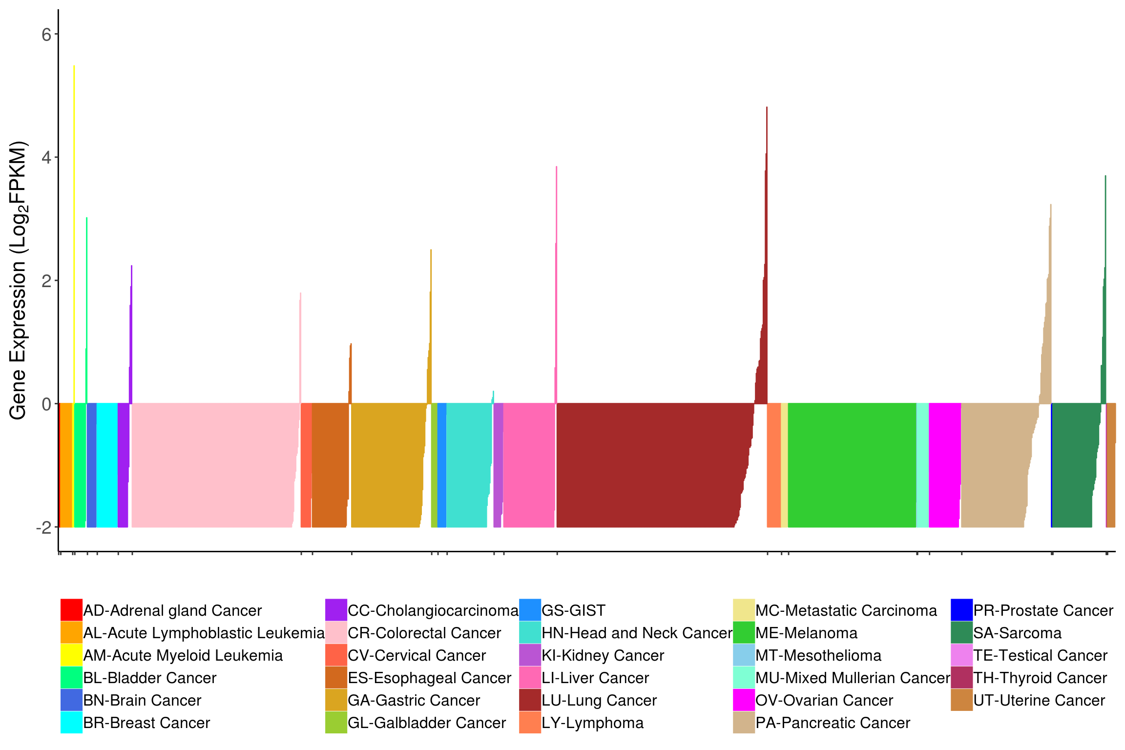
### Stacked

# Normal

# single
barData <- readRDS('data/dataForBarPlot_TCGA.rds')

barData <- barData[barData$Program=='TCGA',]

dataForBarPlot <- data.frame(Size=c(barData$Seq, barData$Exp),
                             Project=rep(barData$Project,2),
                             Type=rep(c('Seq','Exp'),each=nrow(barData)),
                             stringsAsFactors = F)

#dataForBarPlot$Size <- ifelse(dataForBarPlot$Type=='Seq',dataForBarPlot$Size, dataForBarPlot$Size*-1)

o <- order(dataForBarPlot$Size[dataForBarPlot$Type=='Seq'], decreasing = T)

dataForBarPlot$Project <- factor(dataForBarPlot$Project,
                                 levels=dataForBarPlot$Project[dataForBarPlot$Type=='Seq'][o])

ggplot(dataForBarPlot, aes(y = Size, x = Project, fill = Type)) +
  geom_bar(stat="identity", width=0.8) +
  #geom_text(aes(y = pos, x = pathway, label = paste0(percentage, "%")),
  #           data = dataForPlot) +
  labs(x='', y='Number of Samples') +
  #facet_grid(Category ~ .) + #, scales = "free"
  #ylim(0,60) +
  scale_fill_manual(values=c("#4285F4", "#FBBC05")) +
  #scale_fill_manual(values=c("#56B4E9", "#E69F00")) +
  #scale_y_continuous(labels = dollar_format(suffix = "%", prefix = "")) +
  theme_bw()+theme(axis.line = element_line(colour = "black"),
                   panel.grid.major = element_blank(),
                   panel.grid.minor = element_blank(),
                   panel.border = element_rect(colour='white'),
                   panel.background = element_blank()) +
  theme(axis.text=element_text(size=14, color='black'),
        axis.text.x =element_text(size=14, angle = 45, color='black', hjust = 1),
        axis.title.x =element_blank(),
        axis.title.y =element_text(size=16),
        strip.text = element_text(face = 'bold', size=12)) +
  theme(legend.text = element_text(size=12),
        legend.title = element_blank(),
        legend.position = 'top') +
  theme(plot.margin =  margin(t = 0.25, r = 0.25, b = 0.25, l = 0.25, unit = "cm"))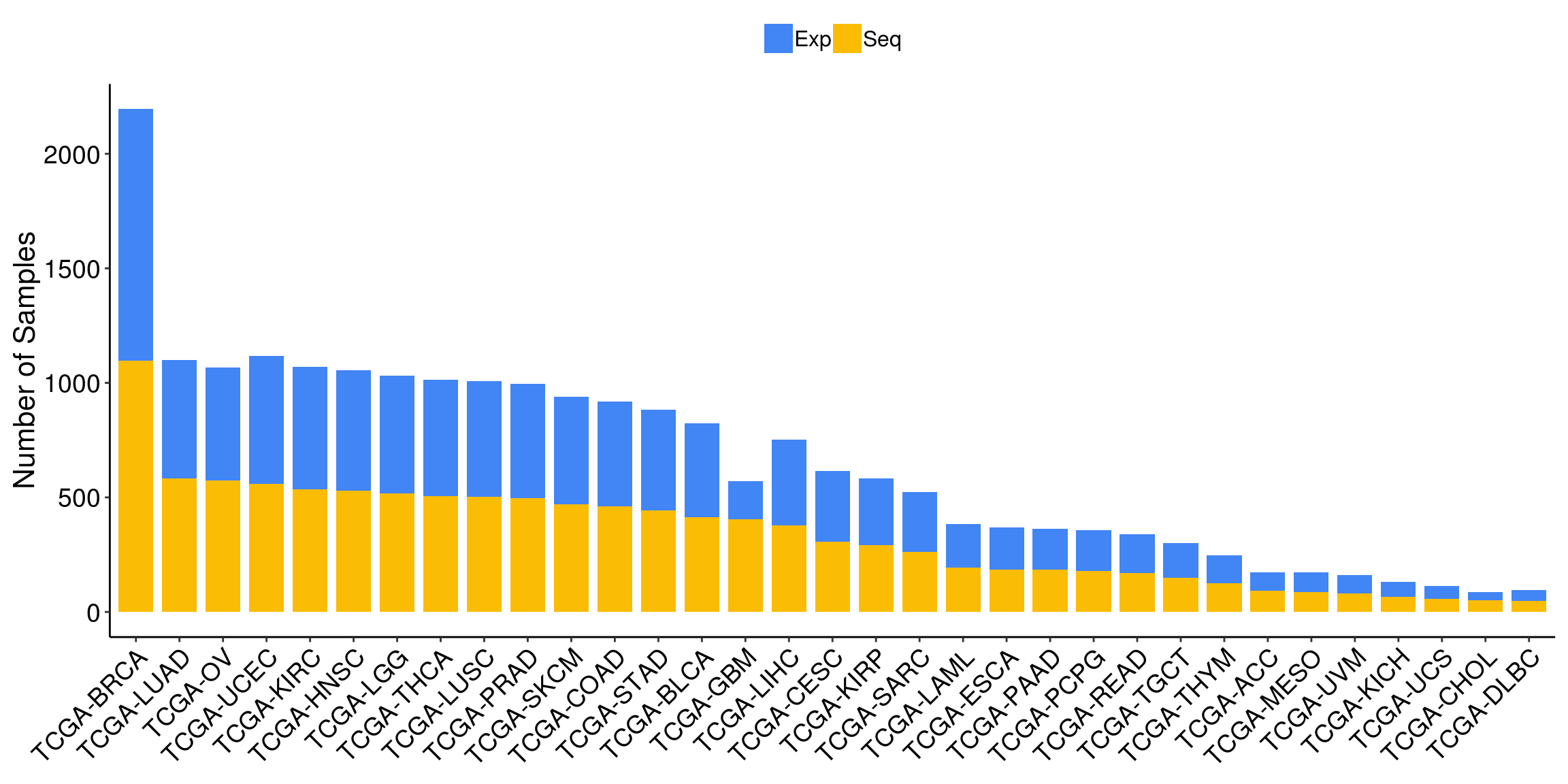
# Percentage label
barData <- readRDS('data/dataForBarPlot_TCGA.rds')

barData <- barData[barData$Program=='TCGA',]

barData$ExpPercent <- round(barData$Exp/(barData$Exp+barData$Seq),2)*100
barData$SeqPercent <- 100 - barData$ExpPercent

dataForBarPlot <- data.frame(Percent=c(barData$SeqPercent, barData$ExpPercent),
                             Project=rep(barData$Project,2),
                             Type=rep(c('Seq','Exp'),each=nrow(barData)),
                             stringsAsFactors = F)

pos <- dataForBarPlot %>% group_by(Project) %>%
  transmute(pos=cumsum(Percent)-0.5*Percent)

dataForBarPlot$Pos <- pos$pos

o <- order(dataForBarPlot$Percent[dataForBarPlot$Type=='Seq'], decreasing = T)

dataForBarPlot$Project <- factor(dataForBarPlot$Project,
                                 levels=dataForBarPlot$Project[dataForBarPlot$Type=='Seq'][o])

fill <- c("#40b8d0", "#b2d183")
#fill <- c("orange", "dodgerblue")

ggplot(dataForBarPlot,
       aes(y = Percent, x = Project, fill = Type)) +
  geom_bar(stat="identity") +
  geom_text(data = dataForBarPlot,
            aes(y = Pos, x = Project, label = paste0(Percent, "%"))) +
  labs(x='', y='Percentage') +
  scale_fill_manual(values=fill) +
  scale_y_continuous(labels = dollar_format(suffix = "%", prefix = "")) +
  theme_bw()+theme(axis.line = element_line(colour = "black"),
                   panel.grid.major = element_blank(),
                   panel.grid.minor = element_blank(),
                   panel.border = element_rect(colour='white'),
                   panel.background = element_blank()) +
  theme(axis.text=element_text(size=14, color='black'),
        axis.text.x =element_text(size=14, angle = 45, color='black', hjust = 1),
        axis.title.x =element_blank(),
        axis.title.y =element_text(size=16)) +
  theme(legend.text = element_text(size=14),
        legend.title = element_blank(),
        legend.position = 'top') +
  theme(plot.margin =  margin(t = 0.25, r = 0.25, b = 0.25, l = 0.25, unit = "cm"))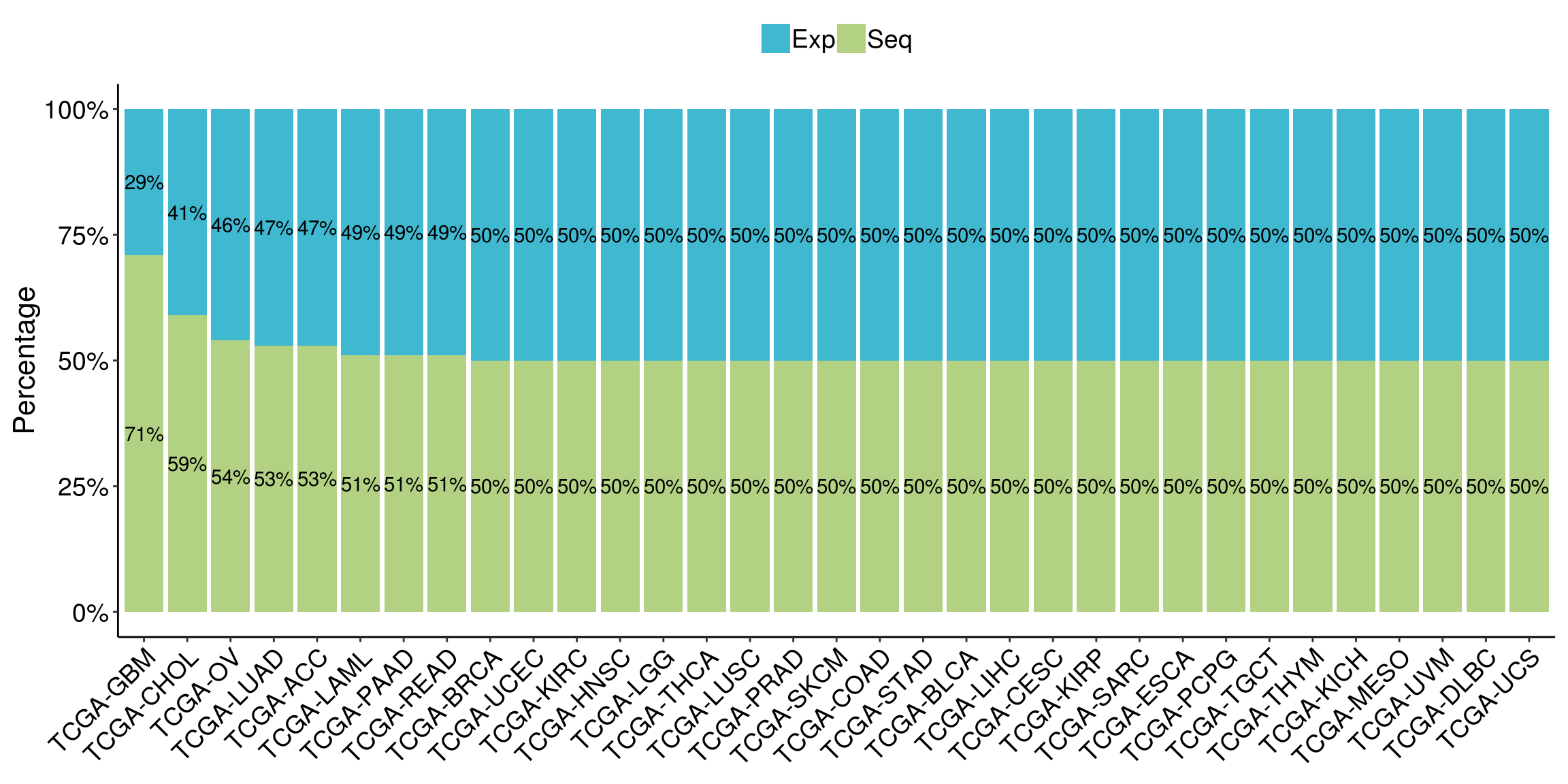
1.3 Scatter plot
# Correlation, single

dataForScatterPlot <- readRDS('data/dataForBoxPlot.rds')

anno <- dataForScatterPlot %>% group_by(dataset) %>%
  summarise(cor = cor.test(DSG3, IL1R2)$estimate, p = cor.test(DSG3, IL1R2)$p.value)


anno_text <- data.frame(
  #label = c("corr = 0.8\np < 0.001"),
  label = paste0('corr = ', round(anno$cor,3), '\n',
                 'p = ', ifelse(anno$p >= 0.01,
                                formatC(anno$p, digits = 2),
                                formatC(anno$p, format = "e", digits = 2))),
  x     = c(2.5),
  y     = c(4)
)

ggplot(data=dataForScatterPlot, aes(x=DSG3, y=IL1R2)) +
  geom_point(size=2, color='darkred') +
  geom_smooth(method='lm') +
  geom_text(data    = anno_text,
            mapping = aes(x = x, y = y, label = label),
            size=4.5) +
  #facet_wrap(~platform) +
  labs(x='Expression Level (DSG3)', y='Expression Level (IL1R2)') +
  theme(legend.position = 'none')+
  theme(axis.text = element_text(size=14),
        axis.title = element_text(size=16),
        strip.text.x = element_text(size=14, face='bold'))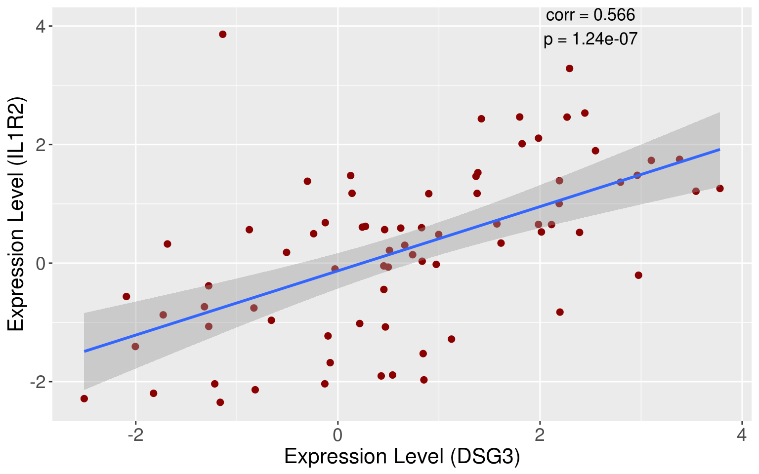
# Correlation, facet_wrap

dataForScatterPlot <- readRDS('data/dataForBoxPlot.rds')
dataForScatterPlot$SampleType <- factor(dataForScatterPlot$SampleType,
                                        levels=c('Normal','Dysplasia'))

#cor.test(scatterData$DSG3, scatterData$IL1R2)
#cor.test(scatterData$DSG3, scatterData$CLDN18)

#dataForScatterPlot <- data.frame(ref=rep(scatterData$DSG3,2),
#                                 expr=c(scatterData$IL1R2, scatterData$CLDN18),
#                                 gene=rep(c('IL1R2', 'CLDN18'), each=nrow(scatterData)))

#anno <- dataForScatterPlot %>% group_by(gene) %>%
#  summarise(cor = cor.test(ref, expr)$estimate, p = cor.test(ref, expr)$p.value)

anno <- dataForScatterPlot %>% group_by(SampleType) %>%
  summarise(cor = cor.test(DSG3, IL1R2)$estimate, p = cor.test(DSG3, IL1R2)$p.value)

anno_text <- data.frame(
  #label = c("corr = 0.446\np < 0.001", "corr = 0.543\np < 0.001"),
  SampleType=anno$SampleType, #SampleType is used for facet_wrap()
  label = paste0('corr = ', round(anno$cor,3), '\n',
                 'p = ', ifelse(anno$p >= 0.01,
                                formatC(anno$p, digits = 2),
                                formatC(anno$p, format = "e", digits = 2))),
  x     = c(2.5,2.5),
  y     = c(4,4)
)

ggplot(data=dataForScatterPlot, aes(x=DSG3, y=IL1R2)) +
  geom_point(size=2, color='darkred') +
  geom_smooth(method='lm') +
  geom_text(data    = anno_text,
            mapping = aes(x = x, y = y, label = label),
            size=4.5) +
  facet_wrap(~SampleType) +
  labs(x='Expression Level (DSG3)', y='Expression Level (IL1R2)') +
  theme(legend.position = 'none')+
  theme(axis.text = element_text(size=14),
        axis.title = element_text(size=16),
        strip.text.x = element_text(size=14, face='bold'))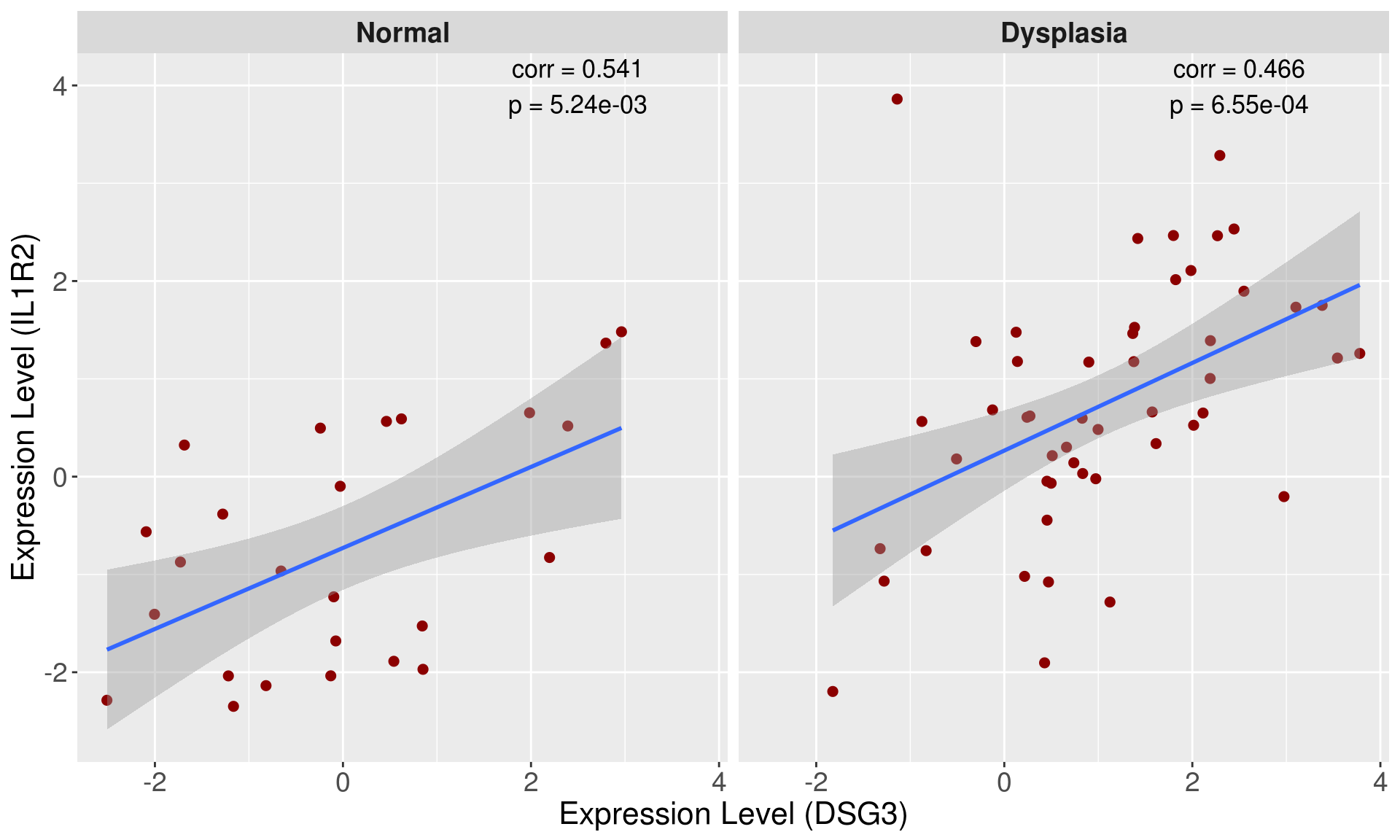
### Time Series
# normal
dataForScatterPlot <- readRDS(file='data/dataForScatterPlot_Time_Series.rds')
#num <- dataForScatterPlot %>% group_by(day, group) %>% mutate(id = row_number())
#rownames(dataForScatterPlot) <- with(num, paste0(group, day, '-', id))

dataForScatterPlot <- dataForScatterPlot %>% group_by(day, group) %>% summarise(sd=sd(expr, na.rm=T), expr=mean(expr, na.rm=T))

ggplot(dataForScatterPlot, aes(day, expr, color=group)) +
  geom_point(size=3) +
  #geom_smooth(method = 'lm', formula = y~ns(x,5), se=FALSE) +
  geom_line() +
  geom_errorbar(aes(ymin=expr-sd, ymax=expr+sd), width=.5, size=0.5, #expr-sd
                position=position_dodge(0)) +
  scale_x_continuous(breaks = c(4,8,12,16,22,26,34)) +
  labs(x='Day', y=expression('mRNA Expression Level (log'[2]*'CPM)'),
       title = NULL) +
  theme(legend.title = element_blank(),
        legend.text = element_text(size=14),
        legend.position = 'right') +
  theme(axis.title=element_text(size=16),
        axis.text = element_text(color='black', size=14),
        axis.text.x = element_text(angle = 0),
        plot.title = element_text(size=16, face='bold')) +
  theme(axis.line = element_line(colour = "black"),
        panel.border = element_blank(),
        panel.background = element_blank(),
        panel.grid = element_blank(),
        panel.grid.major = element_blank())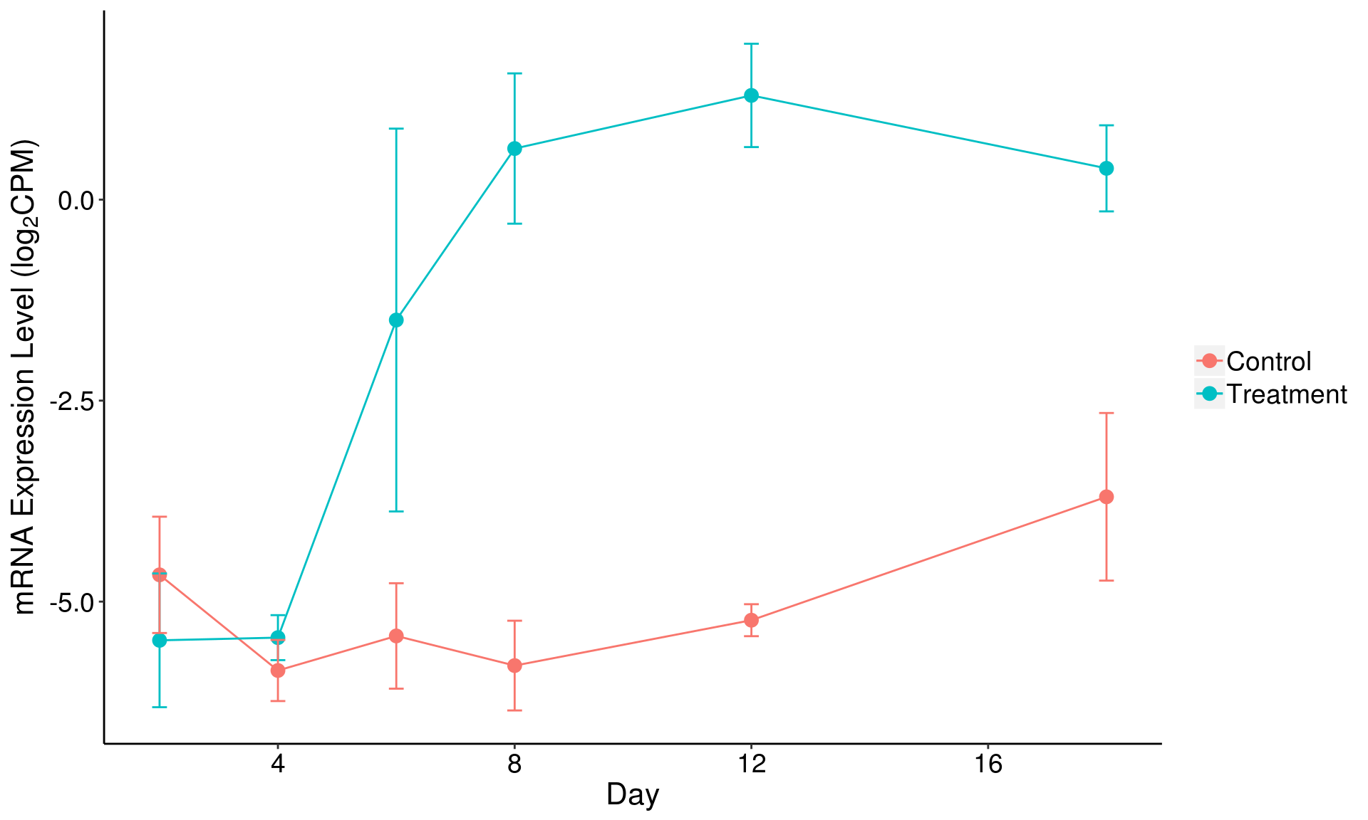
# spline
library(splines) # ns()

dataForScatterPlot <- readRDS(dataForScatterPlot, file='data/dataForScatterPlot_Time_Series.rds')
#num <- dataForScatterPlot %>% group_by(day, group) %>% mutate(id = row_number())
#rownames(dataForScatterPlot) <- with(num, paste0(group, day, '-', id))

ggplot(dataForScatterPlot, aes(day, expr, color=group)) +
  geom_point() +
  geom_smooth(method = 'lm', formula = y~ns(x,5), se=FALSE) +
  scale_x_continuous(breaks = sort(unique(dataForScatterPlot$day))) +
  labs(x='Day', y=expression('mRNA Expression Level (log'[2]*'CPM)'),
       title = NULL) +
  theme(legend.title = element_blank(),
        legend.text = element_text(size=14),
        legend.position = 'right') +
  theme(axis.title=element_text(size=16),
        axis.text = element_text(color='black', size=14),
        axis.text.x = element_text(angle = 0),
        plot.title = element_text(size=16, face='bold')) +
  theme(axis.line = element_line(colour = "black"),
        panel.border = element_blank(),
        panel.background = element_blank(),
        panel.grid = element_blank(),
        panel.grid.major = element_blank())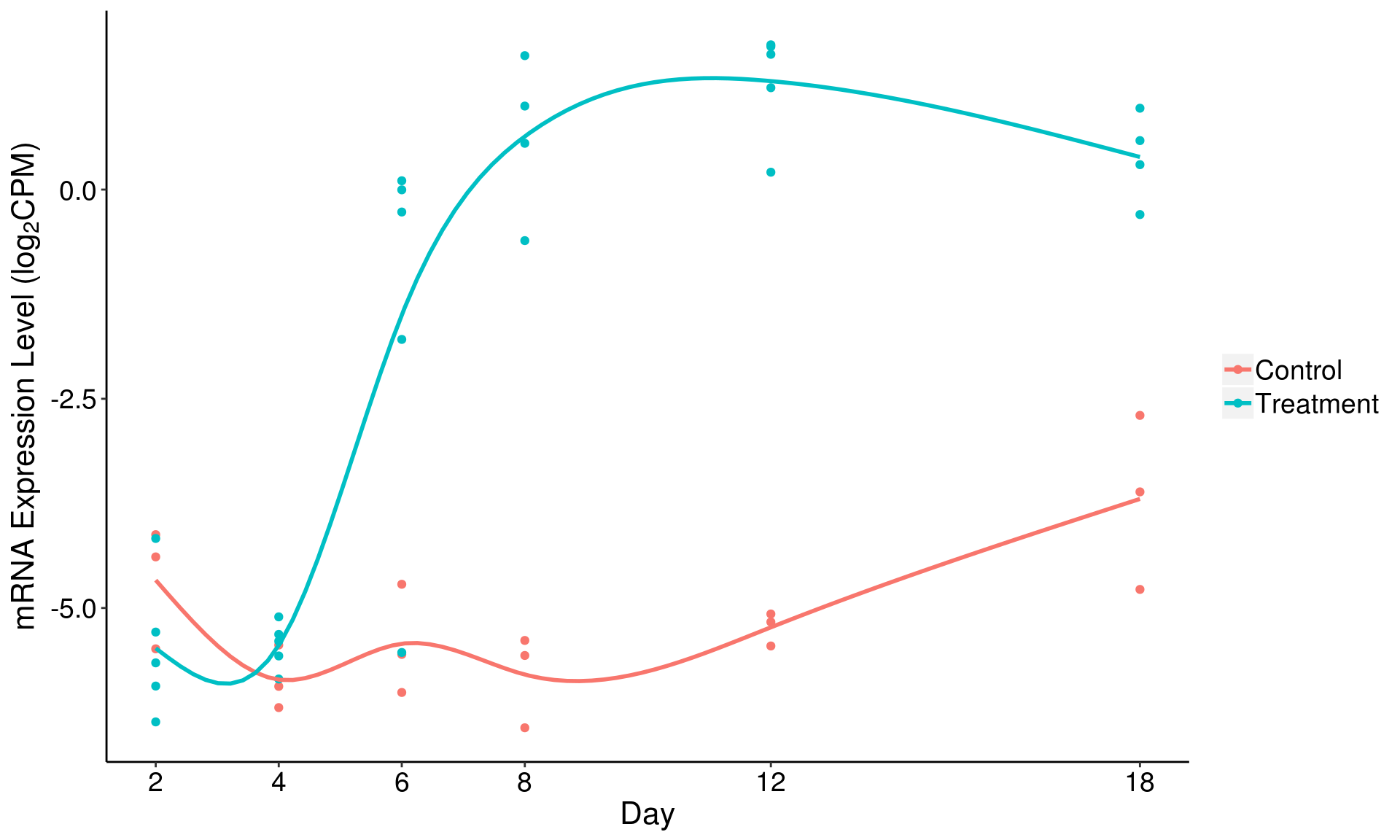
# feature importance
dataForScatterPlot <- readRDS(file='data/dataForScatterPlot_Feature_Importance.rds')
o <- order(dataForScatterPlot$importance, decreasing = F)
dataForScatterPlot$feature <- factor(dataForScatterPlot$feature,
                                     levels=dataForScatterPlot$feature[o])

ggplot(dataForScatterPlot, aes(x=importance, y=feature)) +
  geom_point(color='blue', size=3) + #facet_grid(.~type) +
  geom_segment(aes(y=feature, x=0, xend=importance, yend=feature), color='blue', size=1) +

  xlab('Scaled Variable Importance')+ylab('') +
  #xlim(0,100) +
  theme_bw()+
  #theme_set(theme_minimal()) #
  theme(legend.title = element_blank(),
        legend.text = element_text(size=14),
        legend.position = 'right') +
  theme(axis.title=element_text(size=18),
        axis.text = element_text(color='black', size=14),
        axis.text.x = element_text(angle = 0, hjust=0.5),
        strip.text = element_text(size=14)) +
  theme(axis.line = element_line(colour = "black"),
        #panel.border = element_blank(),
        panel.background = element_blank())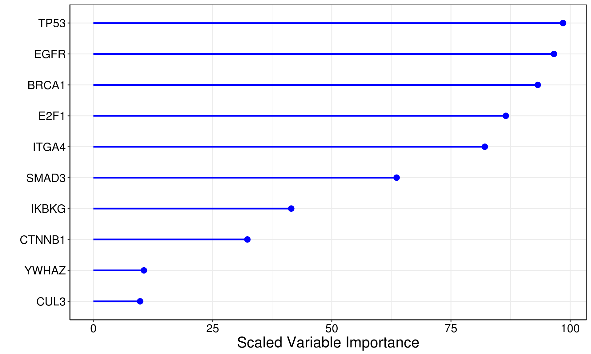
# paired scatter
dataForScatterPlot <- readRDS('data/dataForScatterPlot_Treatment_Response.rds')

dataForScatterPlot$group <- factor(dataForScatterPlot$group,
                                   levels=c('anti-PD1 R (Baseline)', 'anti-PD1 R (Treatment)',
                                            'anti-PD1 NR (Baseline)', 'anti-PD1 NR (Treatment)',
                                            'anti-CTLA4 R (Baseline)', 'anti-CTLA4 R (Treatment)',
                                            'anti-CTLA4 NR (Baseline)', 'anti-CTLA4 NR (Treatment)'))

dataForScatterPlot$groupCol <- factor(dataForScatterPlot$groupCol,
                                      levels=c('anti-PD1 R', 'anti-PD1 NR',
                                               'anti-CTLA4 R', 'anti-CTLA4 NR'))

wtq <- levels(dataForScatterPlot$group)
lis <- combn(wtq,2)

my_comparisons <- tapply(lis, rep(1:ncol(lis), each=nrow(lis)), function(i) i)

idx <- which(!duplicated(unlist(lapply(my_comparisons, function(x) x[1]))))
my_comparisons <- my_comparisons[idx]
idx <- grep('Baseline', unlist(lapply(my_comparisons, function(x) x[1])))
my_comparisons <- my_comparisons[idx]

pValue <- c()

for (i in 1:length(my_comparisons)) {
  #print (my_comparisons[[i]])

  comparisons <- my_comparisons[[i]]

  idx1 <- which(dataForScatterPlot$group==comparisons[1])
  idx2 <- which(dataForScatterPlot$group==comparisons[2])

  df1 <- data.frame(expr=dataForScatterPlot$expr[idx1],
                    subject=dataForScatterPlot$subject[idx1],
                    group=comparisons[1])
  df2 <- data.frame(expr=dataForScatterPlot$expr[idx2],
                    subject=dataForScatterPlot$subject[idx2],
                    group=comparisons[2])


  ovlp <- intersect(df1$subject, df2$subject)

  expr1 <- df1$expr[match(ovlp, df1$subject)]
  expr2 <- df2$expr[match(ovlp, df2$subject)]

  #print (expr1)
  #print (expr2)


  p <- wilcox.test(expr1, expr2, paired=TRUE)$p.value
  #print (p)
  #p2 <- wilcox.test(expr1, expr2)$p.value
  #print (p2)
  pValue <- c(pValue, p)

}

exprMax <- max(dataForScatterPlot$expr) + 0.2

df <- data.frame(x1=c(1,2,1,3,4,3,5,6,5,7,8,7),
                 x2=c(1,2,2,3,4,4,5,6,6,7,8,8),
                 y1=rep(c(exprMax,exprMax,exprMax+0.05),length(pValue)),
                 y2=rep(c(exprMax+0.05, exprMax+0.05, exprMax+0.05),length(pValue)))

anno <- data.frame(x=c(1.5,3.5,5.5,7.5),
                   y=rep(exprMax+0.12,length(pValue)),
                   label=as.character(symnum(pValue, #corr = FALSE, na = FALSE,
                                             cutpoints = c(0, 0.001, 0.01, 0.05, 1),
                                             symbols = c("***",'**','*','ns'))))

ggplot(dataForScatterPlot, aes(x=group, y=expr, group=subject, color=groupCol)) +
  geom_point(size=2) +
  geom_line() +
  #facet_wrap(~dataset) +
  labs(x='', y=expression('Expression Level (Log'[2]*'Intensity)')) +
  geom_segment(data = df,aes(x = x1, y = y1, xend = x2, yend = y2, color=NULL, group=NULL)) +
  geom_text(data = anno, aes(x, y, label=label, group=NULL, color=NULL),
            size=4.5) + # group=NULL, color=NULL should be specified
  theme(legend.position = 'none')+
  theme(axis.text = element_text(size=14,color='black'),
        axis.text.x = element_text(angle = 45, hjust = 1),
        axis.title = element_text(size=16)) +
  theme(strip.text = element_text(size=16)) +
  theme(plot.margin =  margin(t = 0.25, r = 0.25, b = 0.25, l = 0.25, unit = "cm"))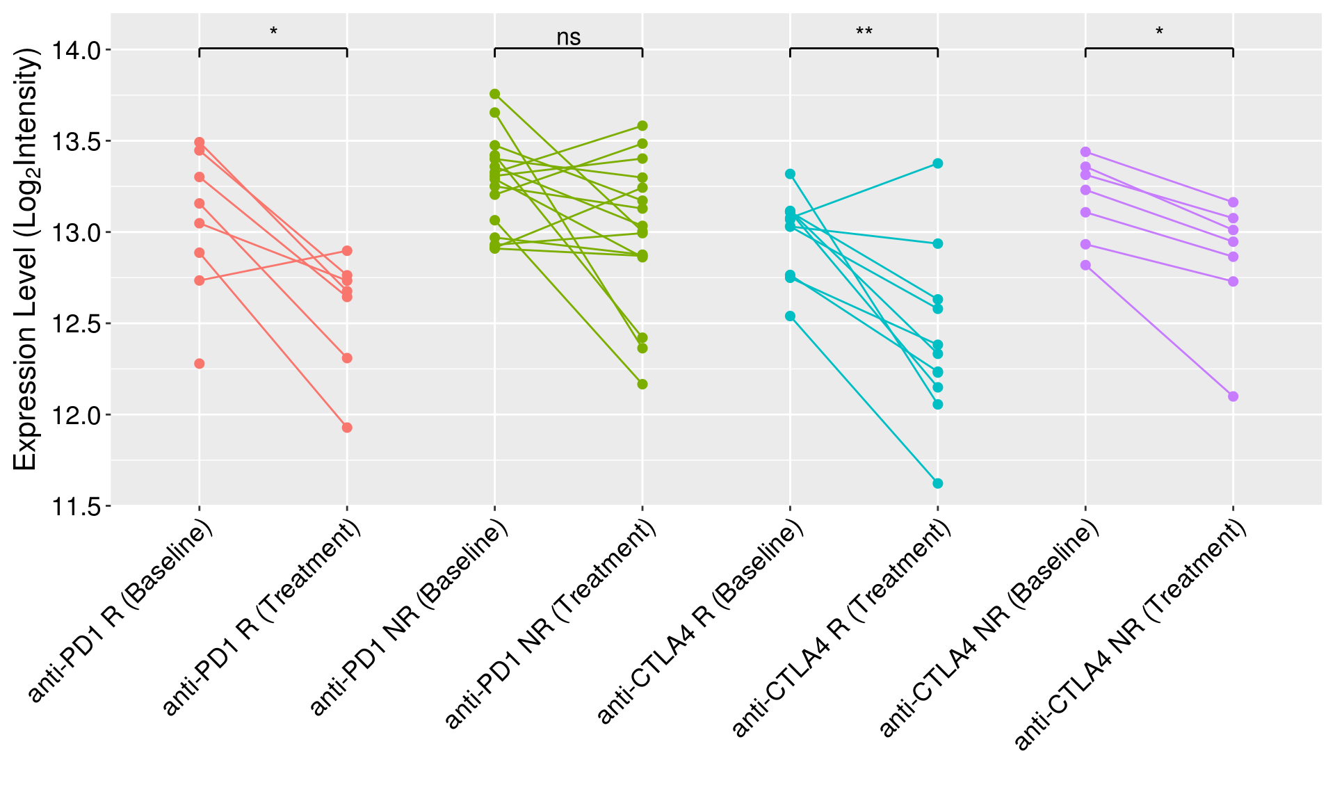
# facet_wrap()

anno <- data.frame(x=1.5,
                   y=exprMax,
                   groupCol=levels(dataForScatterPlot$groupCol),
                   label=as.character(symnum(pValue, #corr = FALSE, na = FALSE,
                                             cutpoints = c(0, 0.001, 0.01, 0.05, 1),
                                             symbols = c("***",'**','*','ns'))))

anno <- data.frame(x = 1.5, y = exprMax,
                   label = ifelse(pValue >= 0.01, paste0('p = ', formatC(pValue, digits = 2)),
                                  paste0('p = ', formatC(pValue, format = "e", digits = 2))),
                   groupCol=levels(dataForScatterPlot$groupCol))

ggplot(data=dataForScatterPlot, aes(x=time, y=expr, group=subject, color=time)) +
  geom_point(size=2) +
  geom_line(color='gray60') +
  scale_color_manual(values=c("#4285F4", "#FBBC05")) +
  facet_wrap(~groupCol) +
  labs(x='', y=expression('Expression Level (Log'[2]*'Intensity)')) +
  #geom_segment(data=df,aes(x = x1, y = y1, xend = x2, yend = y2, color=NULL, group=NULL)) +
  geom_text(data =anno, aes(x, y, label=label, group=NULL, colour=NULL),
            size=4) +
  theme(legend.position = 'none')+
  theme(axis.text = element_text(size=14,color='black'),
        axis.text.x = element_text(angle = 0, hjust = 0),
        axis.title = element_text(size=16)) +
  theme(strip.text = element_text(size=14, face='bold')) +
  #stat_compare_means(comparisons = my_comparisons,
  #                   label = 'p.signif', # p.format
  #                   hide.ns = F,
  #                   #paired = T,
  #                   tip.length = 0.02) + ### NOT IN USE
  theme(plot.margin =  margin(t = 0.25, r = 0.25, b = 0.25, l = 0.25, unit = "cm"))
1.4 Volcano plot
library(ggrepel)

dataForVolcanoPlot <- readRDS(file='data/dataForVolcanoPlot.rds')

logFcThreshold <- log2(1.5)
adjPvalThreshold <- 0.05

dataForVolcanoPlot$Significance[with(dataForVolcanoPlot,
                                     logFC < logFcThreshold | adj.P.Val > adjPvalThreshold)] <- 'NS'
dataForVolcanoPlot$Significance[with(dataForVolcanoPlot,
                                     logFC >= logFcThreshold & adj.P.Val <= adjPvalThreshold)] <- 'UP'
dataForVolcanoPlot$Significance[with(dataForVolcanoPlot,
                                     logFC <= -logFcThreshold & adj.P.Val <= adjPvalThreshold)] <- 'DOWN'

ggplot(dataForVolcanoPlot, aes(x = logFC, y = -log10(adj.P.Val))) +
  #xlim(-7.5,7.5)
  labs(x=expression('log'[2]*'(Fold Change)'),
       y=(expression('-log'[10]*'(FDR)')),
       title=NULL) +
  geom_point(aes(color=Significance), alpha=1, size=2) +
  geom_vline(xintercept = c(-logFcThreshold, logFcThreshold),
             color='darkgreen', linetype='dashed') +
  geom_hline(yintercept = -log10(adjPvalThreshold),
             color='darkgreen',linetype='dashed')+
  #scale_x_continuous(breaks=c(-4,-2,0,2,4,6,8,10)) +
  #scale_y_continuous(expand = c(0.3, 0)) +
  #scale_color_manual(values = c('#4285F4',"gray", '#FBBC05')) +
  scale_color_manual(values = c('green3',"black", "red")) +
  #facet_wrap(~Comparison, ncol = 2) +
  geom_text_repel(data = subset(dataForVolcanoPlot,
                                adj.P.Val < adjPvalThreshold & logFC > log2(2)),
                  segment.alpha = 0.4, aes(label = Symbol),
                  size = 3.5, color='red', segment.color = 'black') +
  geom_text_repel(data = subset(dataForVolcanoPlot,
                                adj.P.Val < adjPvalThreshold & logFC < log2(2)*-1),
                  segment.alpha = 0.4, aes(label = Symbol),
                  size = 3.5, color='green3', segment.color = 'black') +
  theme(legend.position="none") +
  theme(axis.text=element_text(size=14),
        axis.title=element_text(size=16),
        strip.text = element_text(size=14, face='bold')) +
  theme(plot.margin =  margin(t = 0.25, r = 0.25, b = 0.25, l = 0.25, unit = "cm"))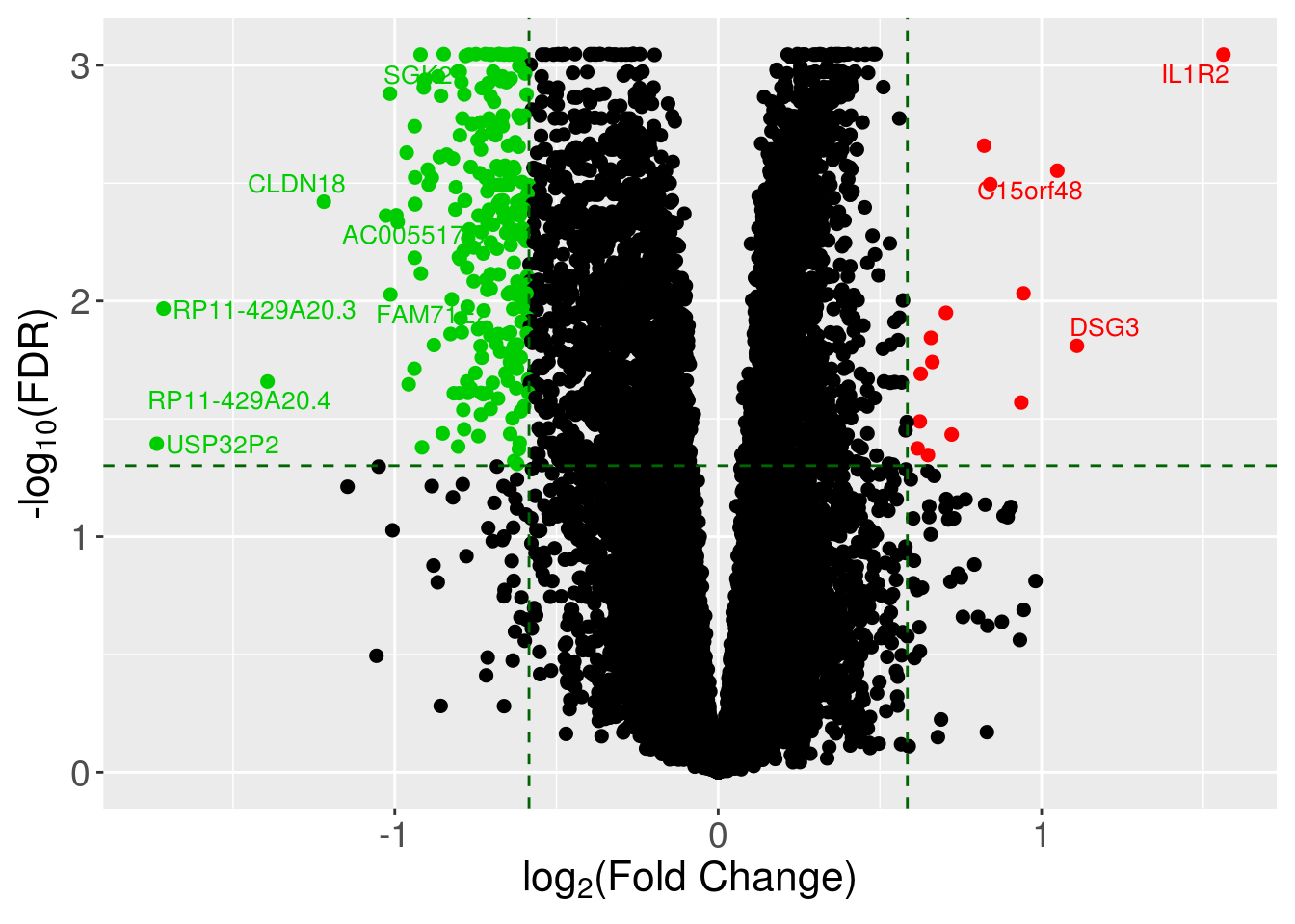
ggplot(dataForVolcanoPlot, aes(x = logFC, y = -log10(adj.P.Val))) +
  #xlim(-7.5,7.5)
  labs(x=expression('log'[2]*'(Fold Change)'),
       y=(expression('-log'[10]*'(FDR)')),
       title=NULL) +
  geom_point(aes(color=Significance), alpha=1, size=2) +
  geom_vline(xintercept = c(-logFcThreshold, logFcThreshold),
             color='darkgreen', linetype='dashed') +
  geom_hline(yintercept = -log10(adjPvalThreshold),
             color='darkgreen',linetype='dashed')+
  #scale_x_continuous(breaks=c(-4,-2,0,2,4,6,8,10)) +
  #scale_y_continuous(expand = c(0.3, 0)) +
  #scale_color_manual(values = c('#4285F4',"gray", '#FBBC05')) +
  scale_color_manual(values = c('green3',"black", "red")) +
  #facet_wrap(~Comparison, ncol = 2) +
  geom_text_repel(data = subset(dataForVolcanoPlot,
                                adj.P.Val < adjPvalThreshold & logFC > log2(2)),
                  segment.alpha = 0.4, aes(label = Symbol),
                  size = 3.5, color='red', segment.color = 'black') +
  geom_text_repel(data = subset(dataForVolcanoPlot,
                                adj.P.Val < adjPvalThreshold & logFC < log2(2)*-1),
                  segment.alpha = 0.4, aes(label = Symbol),
                  size = 3.5, color='green3', segment.color = 'black') +
  theme_bw() +
  theme(axis.line = element_line(colour = "black"),
        panel.grid.major = element_blank(),
        panel.grid.minor = element_blank(),
        panel.border = element_rect(colour='black'),
        panel.background = element_blank()) +
  theme(axis.text=element_text(size=14),
        axis.title=element_text(size=16),
        plot.title = element_text(size = 14, face = 'bold', hjust = 0.5),
        legend.position = 'none',
        #legend.text = element_text(size = 14),
        #legend.title = element_text(size = 14, face = 'bold'),
        strip.text = element_text(size = 14, face = 'bold'))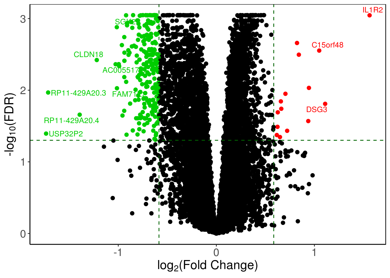
1.5 Venn Diagram
library(VennDiagram)

A <- sample(1:1000, 400, replace = FALSE);
B <- sample(1:1000, 600, replace = FALSE);
C <- sample(1:1000, 350, replace = FALSE);
D <- sample(1:1000, 550, replace = FALSE);
E <- sample(1:1000, 375, replace = FALSE);
G <- sample(1:1000, 200, replace = FALSE);
H <- sample(1:1000, 777, replace = FALSE);

###### Two sets
dataForVennDiagram <- list(A=A,B=B)

vennDiagramColors <- c("dodgerblue", "darkorange1")

vennFilename <- 'report/Venn_Diagram_2Sets_Normal.png'

vennPlot <- venn.diagram(dataForVennDiagram,
                         filename = vennFilename,
                         imagetype = 'png',
                         col = vennDiagramColors,
                         fill = vennDiagramColors,
                         lwd = 2,
                         alpha = 0.25,
                         fontfamily = 'sans',
                         margin = 0.2,
                         cat.dist = 0.03,
                         #cat.default.pos = "outer",
                         #cat.pos = c(-27, 27, 135),
                         cat.col = vennDiagramColors,
                         cat.fontface = 'bold',
                         cat.fontfamily = 'sans',
                         cat.cex = 1,
                         cex = 0.75)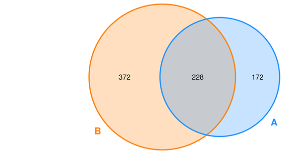
dataForVennDiagram <- list(A=1:100, B=71:170)

vennDiagramColors <- c("dodgerblue", "darkorange1")
vennFilename <- 'report/Venn_Diagram_2Sets_Presentation.png'

vennPlot <- venn.diagram(dataForVennDiagram,
                         filename = vennFilename,
                         imagetype = 'png',
                         col = 'white',
                         fill = vennDiagramColors,
                         lwd = 2,
                         alpha = 0.6,
                         fontfamily = 'sans',
                         margin = 0.2,
                         cat.dist = 0.03,
                         cat.col = vennDiagramColors,
                         cat.fontface = 'bold',
                         cat.fontfamily = 'sans',
                         cat.cex = 0,
                         cex = 0)
### Three Sets
dataForVennDiagram <- list(A=A, B=B, C=C)

vennDiagramColors <- c('#EA4335', '#FBBC05', '#4285F4')
vennFilename <- 'report/Venn_Diagram_3Sets.png'

vennPlot <- venn.diagram(dataForVennDiagram,
                         filename = vennFilename,
                         imagetype = 'png',
                         col = vennDiagramColors,
                         fill = vennDiagramColors,
                         lwd = 2,
                         alpha = 0.25,
                         fontfamily = 'sans',
                         margin = 0.2,
                         cat.dist = 0.03,
                         cat.col = vennDiagramColors,
                         cat.fontface = 'bold',
                         cat.fontfamily = 'sans',
                         cat.cex = 1,
                         cex = 1)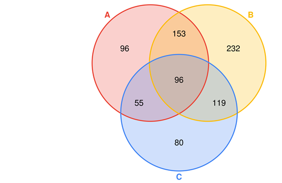
### Four Sets
dataForVennDiagram <- list(A=A, B=B, C=C, D=D)

vennDiagramColors <- c('#EA4335', '#FBBC05', '#34A853', '#4285F4')

vennFilename <- 'report/Venn_Diagram_4Sets_Normal.png'

vennPlot <- venn.diagram(dataForVennDiagram,
                         filename = vennFilename,
                         imagetype = 'png',
                         col = vennDiagramColors,
                         fill = vennDiagramColors,
                         lwd = 2,
                         alpha = 0.25,
                         fontfamily = 'sans',
                         margin = 0.2,
                         cat.dist = c(0.21,0.21,0.1,0.1),
                         cat.col = vennDiagramColors,
                         cat.fontface = 'bold',
                         cat.fontfamily = 'sans',
                         cat.cex = 1,
                         cex = 1)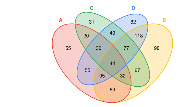
vennFilename <- 'report/Venn_Diagram_4Sets_Dashed.png'

vennPlot <- venn.diagram(dataForVennDiagram,
                         filename = vennFilename,
                         imagetype = 'png',
                         col = 'black',
                         fill = vennDiagramColors,
                         lty = "dashed", # blank
                         lwd = 2,
                         alpha = 0.5,
                         fontfamily = 'sans',
                         margin = 0.2,
                         cat.dist = c(-0.4,-0.4,0.1,0.1),
                         cat.col = vennDiagramColors,
                         cat.fontface = 'bold',
                         cat.fontfamily = 'sans',
                         cat.cex = 1,
                         cex = 1)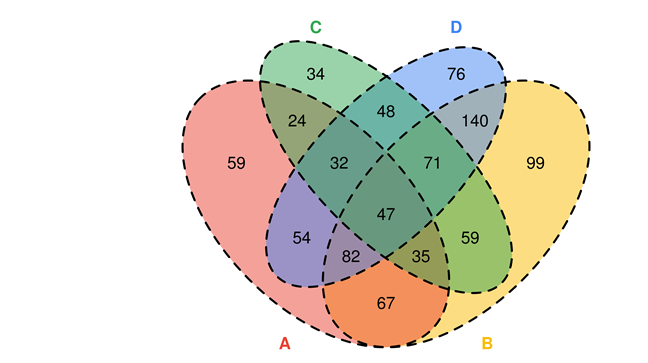
### Five Sets
dataForVennDiagram <- list(A=A, B=B, C=C, D=D, E=E)

#vennDiagramColors <- c('#EA4335', '#FBBC05', '#34A853', '#4285F4', 'orchid3')
vennDiagramColors <- c("dodgerblue", "goldenrod1", "darkorange1", "seagreen3", "orchid3")
vennFilename <- 'report/Venn_Diagram_5Sets.png'

vennPlot <- venn.diagram(dataForVennDiagram,
                         filename = vennFilename,
                         imagetype = 'png',
                         col = 'black',
                         fill = vennDiagramColors,
                         lwd = 2,
                         alpha = 0.5,
                         #lty = "dashed",
                         fontfamily = 'sans',
                         margin = 0.1,
                         #cat.dist = c(0.21,0.21,0.1,0.1),
                         cat.col = vennDiagramColors,
                         cat.fontface = 'bold',
                         cat.fontfamily = 'sans',
                         cat.cex = 1.5,
                         cex = c(1.5, 1.5, 1.5, 1.5, 1.5, 1, 0.8,
                                 1, 0.8, 1, 0.8, 1, 0.8, 1, 0.8,
                                 1, 0.8, 1, 0.8, 1, 0.8, 1, 0.8,
                                 1, 0.8, 1, 1, 1, 1, 1, 1.5))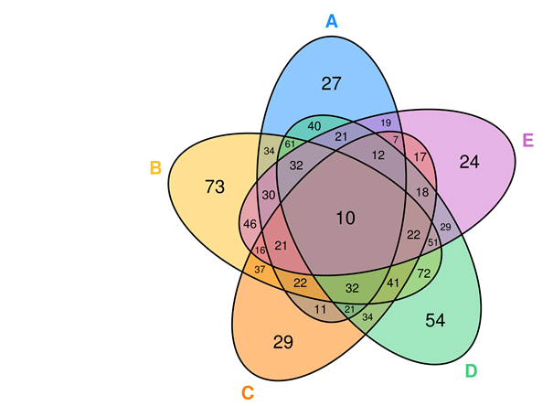
## A Venn object on 5 sets named
## A,B,C,D,E
## 00000 10000 01000 11000 00100 10100 01100 11100 00010 10010 01010 11010
##     0    28    70    43    20    13    34    31    47    47    84    52
## 00110 10110 01110 11110 00001 10001 01001 11001 00101 10101 01101 11101
##    22    17    44    25    29    15    41    23    10    15    14    16
## 00011 10011 01011 11011 00111 10111 01111 11111
## 40 19 37 27 18 12 42 17## [1] 159 427 278 306 638 845 695 262 121 827 849 317 209 205 346 955 914### Six Sets
library(venn)
dataForVennDiagram <- list(A=A, B=B, C=C, D=D, E=E, G=G)
#vennDiagramColors <- c('#EA4335', '#FBBC05', '#34A853', '#4285F4', 'orchid3')
vennDiagramColors <- c("dodgerblue", "goldenrod1", "darkorange1", "seagreen3", "orchid3", 'cyan') # TODO: cyan is not good enough
vennFilename <- 'report/Venn_Diagram_6Sets.png'
venn(dataForVennDiagram, zcolor = "style", opacity = 0.25, cexil = 0.5, cexsn = 0.5, ellipse = FALSE)
1.6 UpSet plot
#devtools::install_github("hms-dbmi/UpSetR")
library(UpSetR)

A <- sample(1:1000, 400, replace = FALSE);
B <- sample(1:1000, 600, replace = FALSE);
C <- sample(1:1000, 350, replace = FALSE);
D <- sample(1:1000, 550, replace = FALSE);
E <- sample(1:1000, 375, replace = FALSE);
G <- sample(1:1000, 200, replace = FALSE);
H <- sample(1:1000, 777, replace = FALSE);

dataForUpSetPlot <- list(A=A, B=B, C=C, D=D, E=E, G=G, H=H)
setsBarColors <- c('#EA4335', '#FBBC05', '#34A853', '#4285F4')

### sort by degree
upset(fromList(dataForUpSetPlot),
      nsets=length(dataForUpSetPlot),
      nintersects = 1000,
      sets = c("A", "B", "C", 'D'),
      #keep.order = TRUE,
      point.size = 3,
      line.size = 1,
      number.angles = 0,
      text.scale = c(1.5, 1.2, 1.2, 1, 1.5, 1), # ytitle, ylabel, xtitle, xlabel, sets, number
      order.by="degree",
      matrix.color="black",
      main.bar.color = 'black',
      mainbar.y.label = 'Intersection Size',
      sets.bar.color=setsBarColors,
      queries = list(list(query = intersects,
           params = list('A','B','C'), color = "orange", active = T)))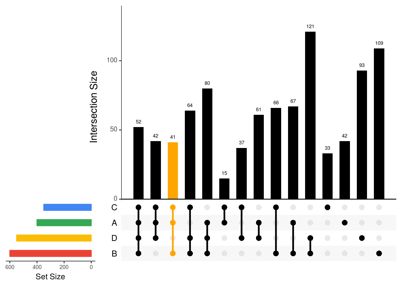
### sort by frequency of intersection
upset(fromList(dataForUpSetPlot),
      nsets=length(dataForUpSetPlot),
      nintersects = 1000,
      sets = c("A", "B", "C", 'D'),
      #keep.order = TRUE,
      point.size = 3,
      line.size = 1,
      number.angles = 0,
      text.scale = c(1.5, 1.2, 1.2, 1, 1.5, 1), # ytitle, ylabel, xtitle, xlabel, sets, number
      order.by="freq",
      matrix.color="black",
      main.bar.color = 'black',
      mainbar.y.label = 'Intersection Size',
      sets.bar.color=setsBarColors)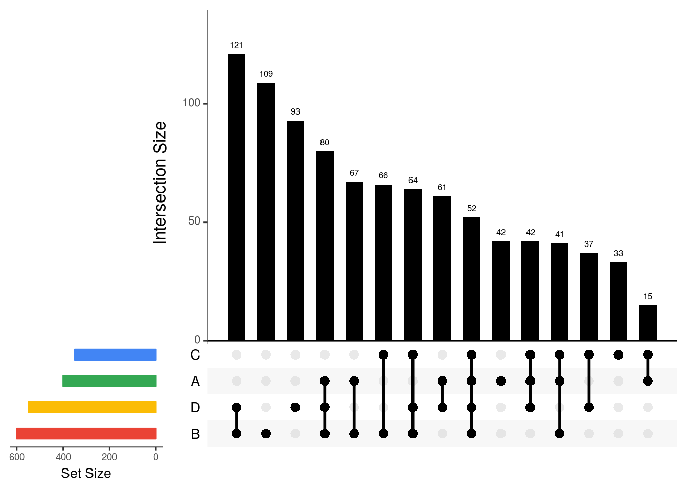
### sort by degree, then frequency, keep order
upset(fromList(dataForUpSetPlot),
      nsets=length(dataForUpSetPlot),
      nintersects = 1000,
      sets = c("A", "B", "C", 'D'),
      keep.order = TRUE,
      point.size = 3,
      line.size = 1,
      number.angles = 0,
      text.scale = c(1.5, 1.2, 1.2, 1, 1.5, 1), # ytitle, ylabel, xtitle, xlabel, sets, number
      #order.by="degree",
      matrix.color="black",
      main.bar.color = 'black',
      mainbar.y.label = 'Intersection Size',
      sets.bar.color=setsBarColors)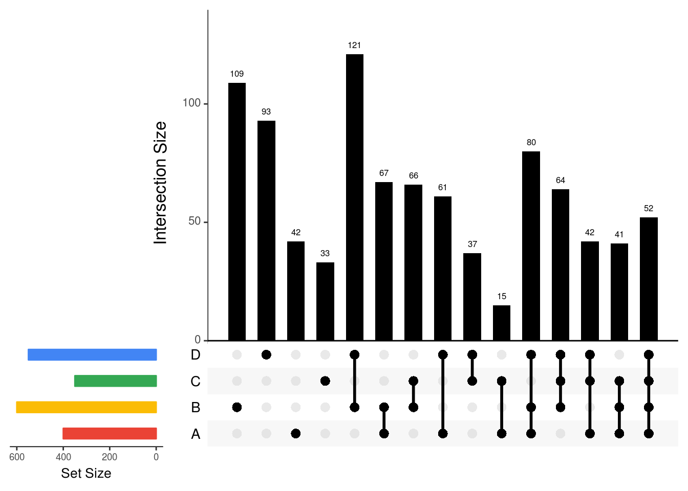
### all sets
setsBarColors <- c("dodgerblue", "goldenrod1", "darkorange1", "seagreen3", "orchid3", 'cyan3', 'brown2')

upset(fromList(dataForUpSetPlot),
      nsets=length(dataForUpSetPlot),
      nintersects = 1000,
      #sets = c("A", "B", "C", 'D','E','G','H'),
      #keep.order = TRUE,
      point.size = 1,
      line.size = 0.5,
      number.angles = 0,
      text.scale = c(1.5, 1.2, 1.2, 1, 1.5, 1), # ytitle, ylabel, xtitle, xlabel, sets, number
      #order.by="degree",
      matrix.color="black",
      main.bar.color = 'black',
      mainbar.y.label = 'Intersection Size',
      sets.bar.color=setsBarColors)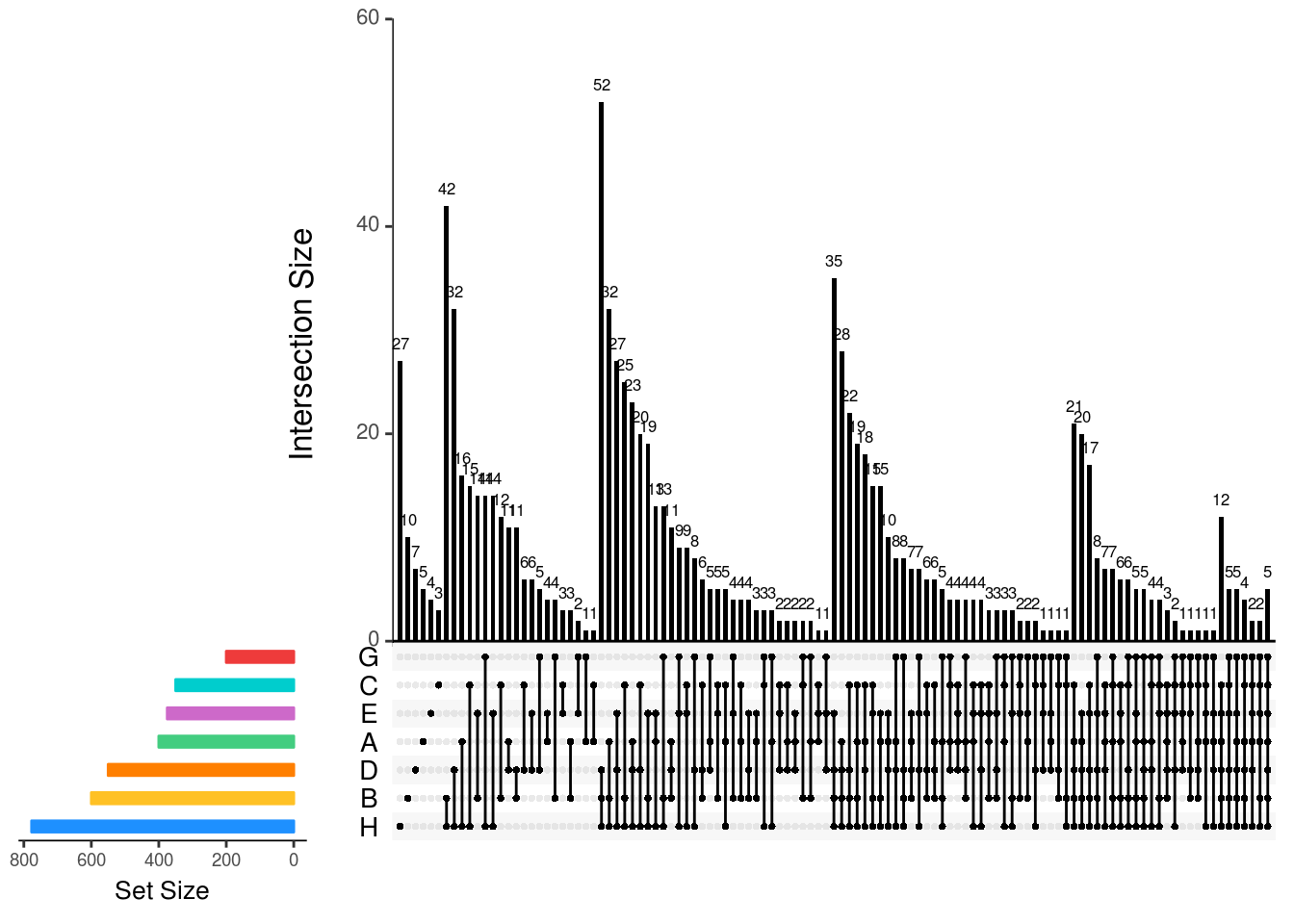
1.7 Heatmap
library(ComplexHeatmap)
library(RColorBrewer)
library(GEOquery)

eSet <- readRDS('data/dataForHeatmap_eSet.rds')
exprData <- exprs(eSet)
phenoData <- pData(eSet)

phenoData$SampleType <- factor(phenoData$SampleType, levels=c('Normal','Dysplasia'))
phenoData$HistologyGrade <- factor(phenoData$HistologyGrade,
                                   levels=c('Normal','Hyperplasia','Mild dysplasia',
                                            'Moderate dysplasia','Severe dysplasia'))

o <- order(phenoData$SampleType, phenoData$HistologyGrade)
phenoData <- phenoData[o,]
exprData <- exprData[,o]

scaledExprData <- t(scale(t(exprData)))

annoColors <- list(
  `Histology Grade`=c(Normal='gray96',
                   Hyperplasia='gray72',
                   `Mild dysplasia`='gray48',
                   `Moderate dysplasia`='gray14',
                   `Severe dysplasia`='gray0'),
  `Sample Type`=c(Normal='darkolivegreen',
                  Dysplasia='lightcoral'))

topAnnotation = HeatmapAnnotation(`Sample Type`=phenoData[,'SampleType'],
                                  `Histology Grade`=phenoData[,'HistologyGrade'],
                                  col=annoColors,
                                  simple_anno_size_adjust = TRUE,
                                  #annotation_height = c(1,1),
                                  height = unit(8, "mm"),
                                  #summary = anno_summary(height = unit(4, "cm")),
                                  show_legend = c("bar" = TRUE),
                                  show_annotation_name = F)


col_fun = colorRampPalette(rev(c("red",'white','blue')), space = "Lab")(100)
#col_fun = colorRampPalette(rev(brewer.pal(n = 7, name ="RdYlBu")))(100)
# col_fun = colorRamp2(c(-4, 0, 4), c("blue", "white", "red")) # For Legend()
#library(colorspace)
#col_fun = diverge_hcl(100, c = 100, l = c(50,90), power = 1.5)


### pre-defined order of columns
ht <- Heatmap(scaledExprData,
              #name = 'Expression',

              # COLOR
              #col = colorRampPalette(rev(c("red",'white','blue')), space = "Lab")(100),
              col=col_fun,
              na_col = 'grey',

              # MAIN PANEL
              column_title = NULL,
              cluster_columns = FALSE,
              cluster_rows = TRUE,
              show_row_dend = TRUE,
              show_column_dend = TRUE,
              show_row_names = FALSE,
              show_column_names = TRUE,
              column_names_rot = 90,
              column_names_gp = gpar(fontsize = 10),
              #column_names_max_height = unit(3, 'cm'),
              #column_split = factor(phenoData$Day,
              #                      levels=str_sort(unique(phenoData$Day), numeric = T)),

              column_order = rownames(phenoData),

              # ANNOTATION
              top_annotation = topAnnotation,

              # LEGEND
              heatmap_legend_param = list(
                #at = c(-5, 0, 5),
                #labels = c("low", "zero", "high"),
                title = "Expression",
                title_position = 'leftcenter-rot',
                legend_height = unit(3, "cm"),
                adjust = c("right", "top")
              ))

draw(ht,annotation_legend_side = "right",row_dend_side = "left")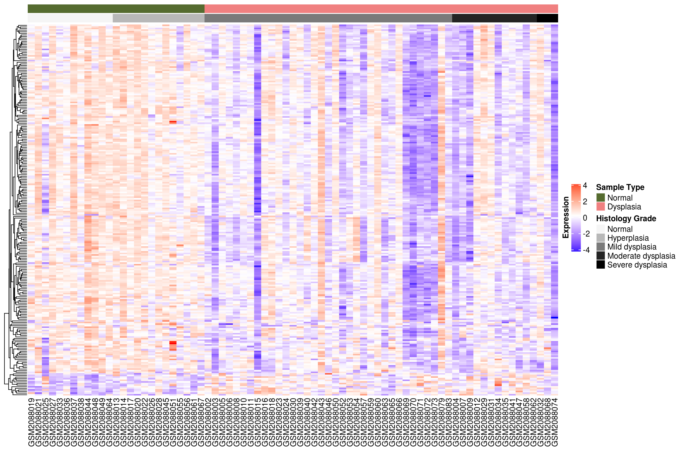
#library(circlize)
#col_fun = colorRamp2(c(0, 0.5, 1), c("blue", "white", "red"))
#lgd = Legend(col_fun = col_fun, title = "foo")
#draw(lgd, x = unit(1, "npc"), y = unit(1, "npc"), just = c("right", "top"))
### fold change
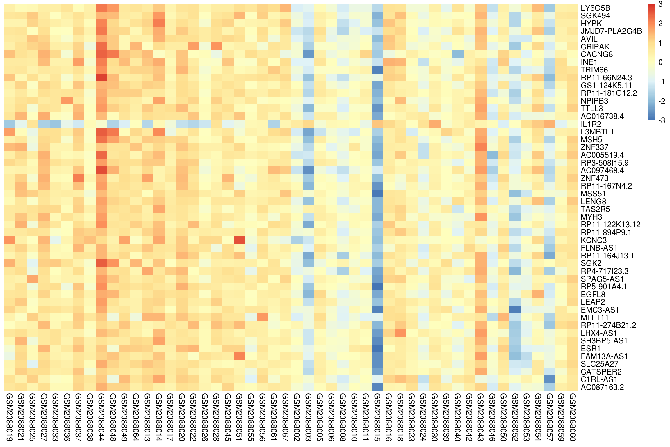
fcMatrix <- readRDS(file='data/dataForHeatmap_fcMatrix.rds')
library(colorspace)
col_fun = diverge_hcl(100, c = 100, l = c(50,90), power = 1.5)
#pie(rep(1, length(col_fun)), col = col_fun , main="")
ht <- Heatmap(fcMatrix,
#name = 'Expression',
# COLOR
#col = colorRampPalette(rev(c("red",'white','blue')), space = "Lab")(100),
col=col_fun,
na_col = 'grey',
# MAIN PANEL
column_title = NULL,
cluster_columns = FALSE,
cluster_rows = TRUE,
show_row_dend = TRUE,
show_column_dend = TRUE,
show_row_names = FALSE,
show_column_names = TRUE,
column_names_rot = 90,
column_names_gp = gpar(fontsize = 12),
#column_names_max_height = unit(10, 'cm'),
#column_split = factor(phenoData$Day,
# levels=str_sort(unique(phenoData$Day), numeric = T)),
#column_order = rownames(phenoData),
# ANNOTATION
#top_annotation = topAnnotation,
# LEGEND
heatmap_legend_param = list(
at = c(-3, -2, -1, 0, 1, 2, 3),
#labels = c("low", "zero", "high"),
title = expression('Log'[2]*'(Fold Change)'),
title_position = 'leftcenter-rot',
legend_height = unit(3, "cm"),
just = c("right", "top")
))
draw(ht,annotation_legend_side = "right",row_dend_side = "left", heatmap_legend_side = "right")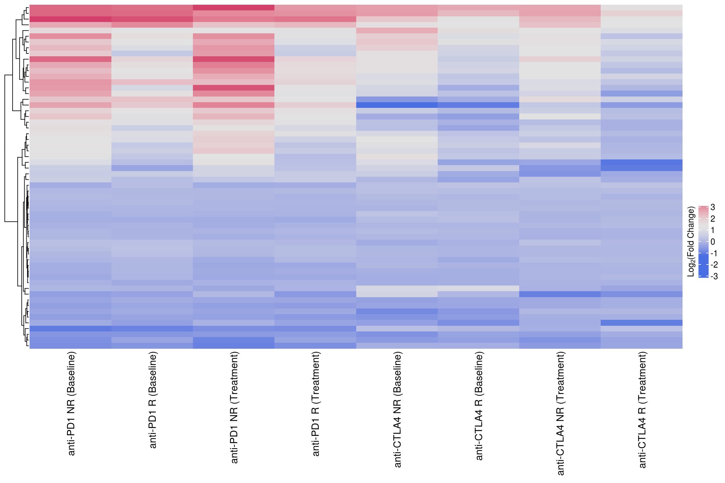
### text
dataForHeatmap <- readRDS(file='data/dataForHeatmap_0and1.rds')
annoMatrix <- ifelse(dataForHeatmap==0,'','*')

display.brewer.all(type="seq")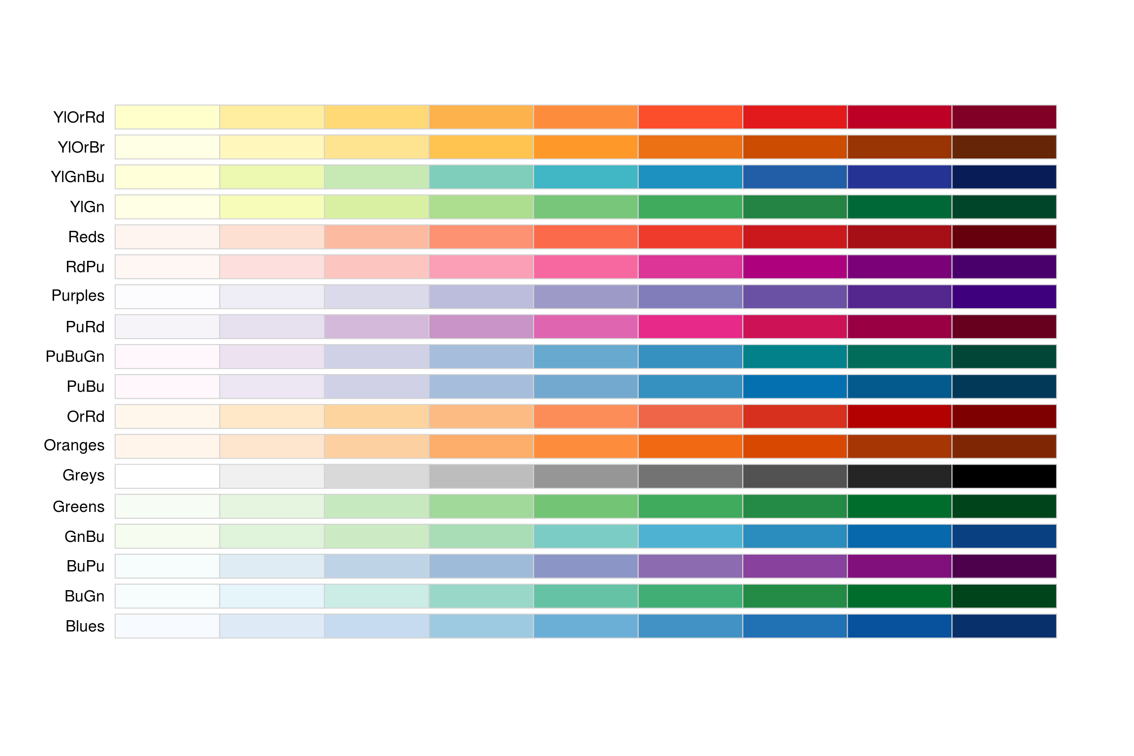
cols = brewer.pal(4, "Reds")
#cols
#?brewer.pal()

cols = colorRampPalette(cols)(10)
pie(rep(1, length(cols)), col = cols , main="")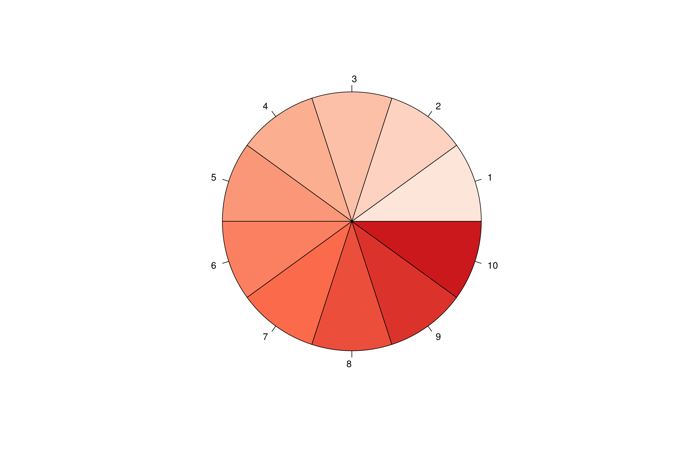
col_fun = colorRampPalette(rev(c(cols[10],cols[1])), space = "Lab")(2)


ht <- Heatmap(dataForHeatmap,
              #name = 'Expression',

              # COLOR
              #col = colorRampPalette(rev(c("red",'white','blue')), space = "Lab")(100),
              col=col_fun,
              na_col = 'grey',
              rect_gp = gpar(col = "grey", lwd = 0.5),

              # MAIN PANEL
              column_title = NULL,
              cluster_columns = TRUE,
              cluster_rows = TRUE,
              show_row_dend = TRUE,
              show_column_dend = TRUE,
              show_row_names = TRUE,
              show_column_names = TRUE,
              column_names_rot = 90,
              column_names_gp = gpar(fontsize = 10),
              row_names_gp = gpar(fontsize = 10),
              #column_names_max_height = unit(3, 'cm'),
              #column_split = factor(phenoData$Day,
              #                      levels=str_sort(unique(phenoData$Day), numeric = T)),

              #column_order = rownames(phenoData),

              # ANNOTATION
              #top_annotation = topAnnotation,

              # ADD TEXT
              cell_fun = function(j, i, x, y, w, h, col) { # add text to each grid
                grid.text(annoMatrix[i, j], x, y, gp = gpar(fontsize = 12, col = "black", fill = 'black'))
              },

              # LEGEND
              heatmap_legend_param = list(
                at = c(0, 1),
                labels = c("Negative",'Positive'),
                title = "",
                title_position = 'leftcenter-rot',
                legend_height = unit(3, "cm"),
                adjust = c("right", "top")
              ))

draw(ht,annotation_legend_side = "right",row_dend_side = "left")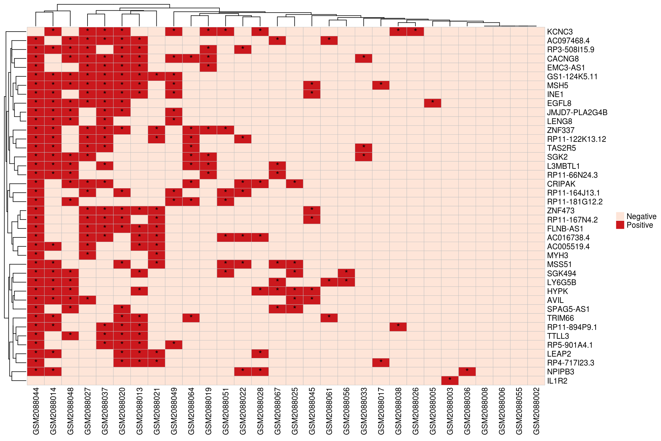
## continuous
dataForHeatmap <- readRDS(file='data/dataForHeatmap_0to1.rds')
cols = brewer.pal(4, "Reds")
cols = colorRampPalette(cols)(10)
col_fun = colorRampPalette(rev(c(cols[10],'white')), space = "Lab")(100)
#col_fun = colorRampPalette(rev(c(cols[10],cols[1])), space = "Lab")(100)
ht <- Heatmap(dataForHeatmap,
              #name = 'Expression',

              # COLOR
              #col = colorRampPalette(rev(c("red",'white','blue')), space = "Lab")(100),
              col=col_fun,
              na_col = 'white',
              rect_gp = gpar(col = "grey", lwd = 0.5),

              # MAIN PANEL
              column_title = NULL,
              cluster_columns = FALSE,
              cluster_rows = FALSE,
              show_row_dend = TRUE,
              show_column_dend = TRUE,
              show_row_names = TRUE,
              show_column_names = TRUE,
              column_names_rot = 90,
              column_names_gp = gpar(fontsize = 10),
              row_names_gp = gpar(fontsize = 10),
              #column_names_max_height = unit(3, 'cm'),
              #column_split = factor(phenoData$Day,
              #                      levels=str_sort(unique(phenoData$Day), numeric = T)),

              #column_order = rownames(phenoData),

              # ANNOTATION
              #top_annotation = topAnnotation,

              # ADD TEXT
              #cell_fun = function(j, i, x, y, w, h, col) { # add text to each grid
              #  grid.text(annoMatrix[i, j], x, y, gp = gpar(fontsize = 12, col = "black", fill = 'black'))
              #},

              # LEGEND
              heatmap_legend_param = list(
                at = c(0, 0.2, 0.4, 0.6, 0.8, 1),
                #labels = c("Negative",'Positive'),
                title = "",
                title_position = 'leftcenter-rot',
                legend_height = unit(3, "cm"),
                adjust = c("right", "top")
              ))

draw(ht,annotation_legend_side = "right",row_dend_side = "left")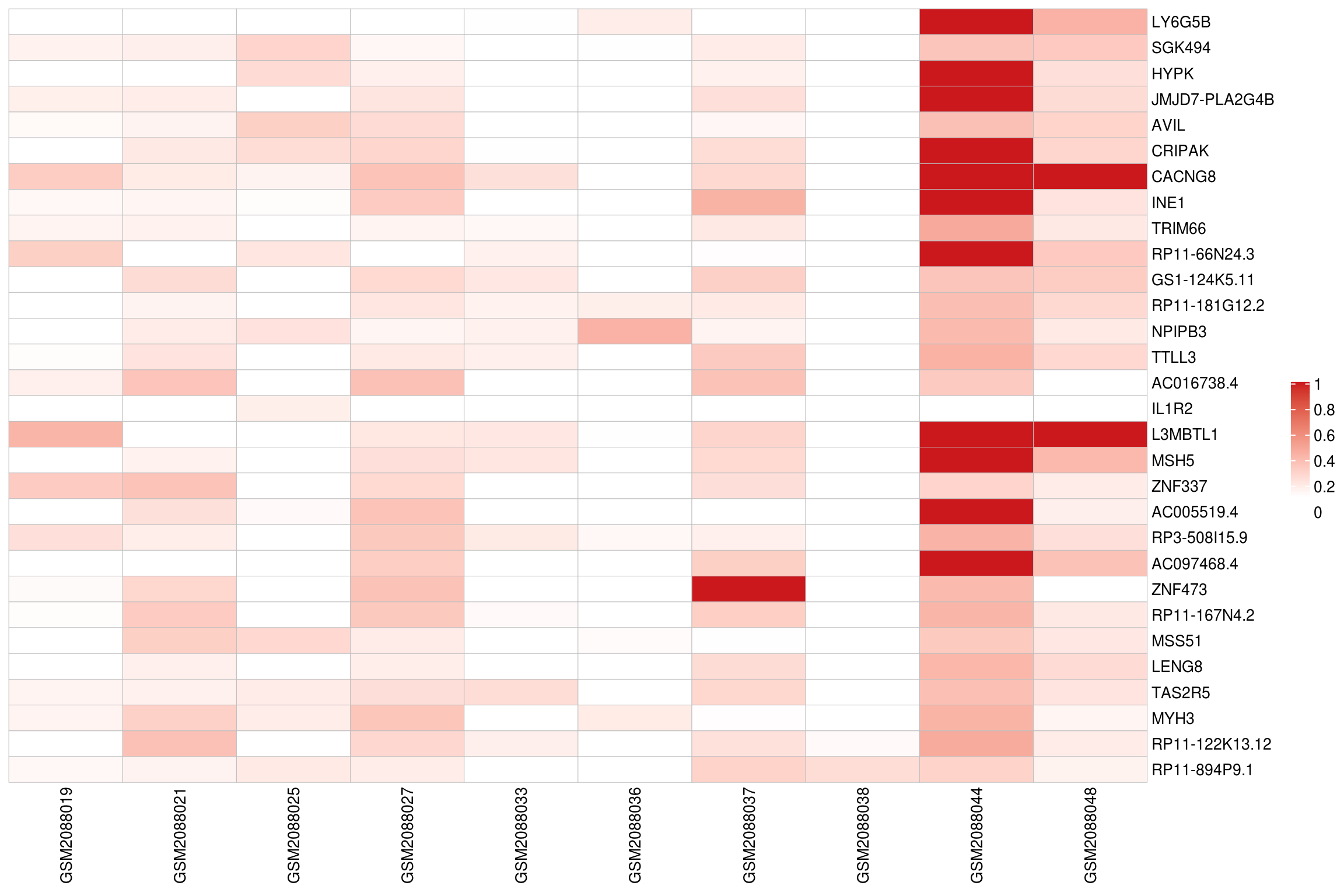
### pheatmap
library(pheatmap)

dataForHeatmap <- scaledExprData[1:50,1:50]

pheatmap(dataForHeatmap,
         scale = 'none',
         cluster_cols = F,
         border_color = NA,
         cluster_rows = F,
         treeheight_row = 0,
         show_rownames = T,
         annotation_legend = F,
         breaks = c(seq(-3,3, 6/100)),
         #color=col_fun
         )
### heatmap.2
#library(gplots)
#lmat = rbind(c(4,3),c(2,1))
#lwid = c(2,4)
#lhei = c(1,5)

#heatmap.2(fcMatrix, col=diverge_hcl(100, c = 100, l = c(50,90), power = 1.5),
#          trace='none', scale='none', density.info="none",
#          cexCol=1, cexRow=0.5,dendrogram='row', srtCol=90,
#          #adjCol=c(0.8,0.15),  #labRow=NA,labCol=NA
#          key.title=NA,na.color=NA,lwid=lwid, lhei=lhei,
#          margins =c(12,5), key.xlab='Log2(Fold Change)')
1.8 Bubble plot
dataForBubblePlot <- readRDS(file='data/dataForBubblePlot.rds')
#dataForBubblePlot <- dataForBubblePlot[dataForBubblePlot$Regulation=='Up',]
#dataForBubblePlot <- dataForBubblePlot[dataForBubblePlot$Benjamini<0.01,]

o <- order(dataForBubblePlot$Comparison, log10(dataForBubblePlot$PValue))
dataForBarPlot <- dataForBubblePlot[o,]


pval <- 0.05

ggplot(dataForBubblePlot, mapping=aes(x=Term, y=Comparison, #y=-log10(Benjamini), #y=Fold.Enrichment
                                      color=PValue,size=Count)) +
  geom_point()+ coord_flip() +
  scale_x_discrete(limits=rev(unique(dataForBubblePlot$Term))) +
  #scale_x_discrete(limits=Order)+
  scale_colour_gradientn(limits=c(0,pval),
                         colors= c("red","yellow","green")) + #
  #facet_wrap(~Comparison) +
  #facet_grid(Regulation~Comparison) + # scales=free
  xlab('')+ylab('') +
  guides(shape = guide_legend(order=1),
         colour = guide_colourbar(order=2, title = 'P Value')) + #'P Value\n(Benjamini)'))
  theme_bw()+theme(axis.line = element_line(colour = "black"),
                   panel.grid.minor = element_blank(),
                   panel.border = element_rect(colour='black'),
                   panel.background = element_blank()) +
  ggtitle("") + theme(plot.title = element_text(hjust = 0.5, size=20)) +
  theme(axis.text=element_text(size=14, color='black'),
        axis.text.x =element_text(size=14, color='black', angle=45, hjust=1),
        axis.title=element_text(size=15)) +
  theme(legend.text = element_text(size = 14),
        legend.title = element_text(size = 14)) +
  theme(strip.text = element_text(size = 14),
        legend.key.size = unit(0.8,'cm'))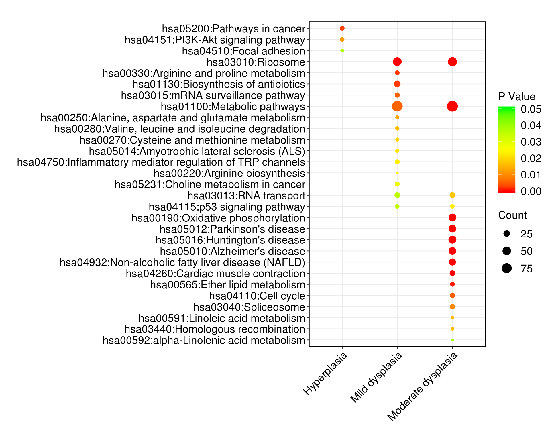
1.9 Radar plot
#devtools::install_github("ricardo-bion/ggradar",
#                         dependencies = TRUE)
library(ggradar)
library(scales)

mtcars_radar <- mtcars %>%
  as_tibble(rownames = "group") %>%
  mutate_at(vars(-group), rescale) %>%
  tail(4) %>%
  select(1:10)

ggradar(mtcars_radar)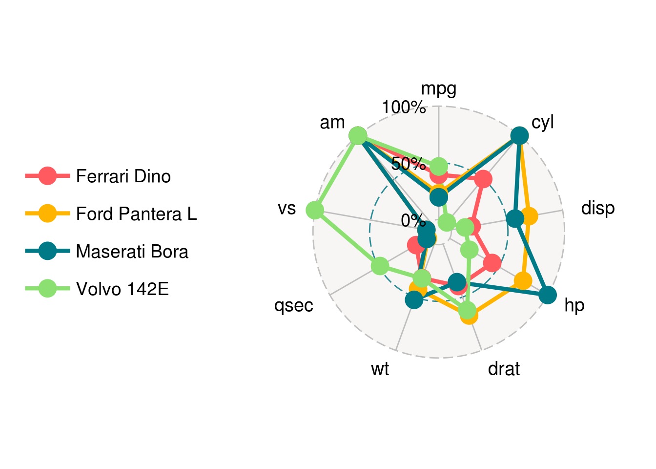
1.10 More …
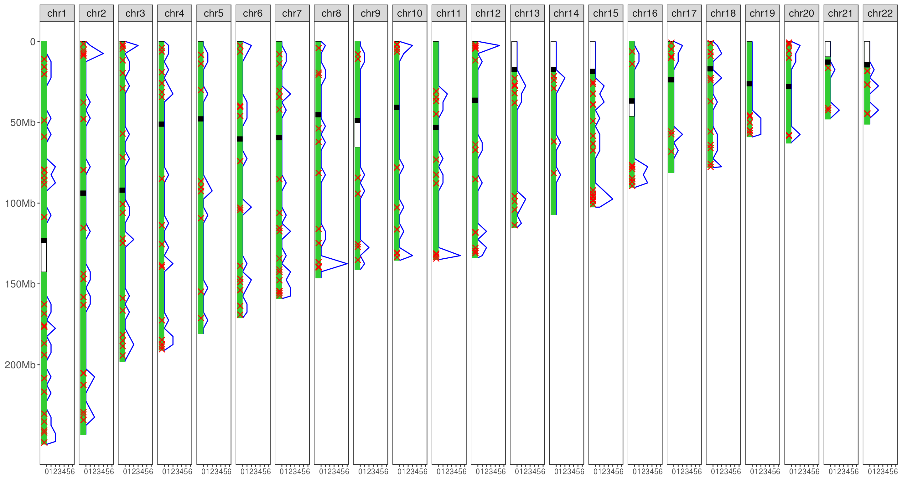
1.10.1 Crossover (Hapi)
#install.packages('Hapi')
library(Hapi)
data(crossover)
data(hg19)

hapiCVMap(chr = hg19, cv = crossover, step = 5)